
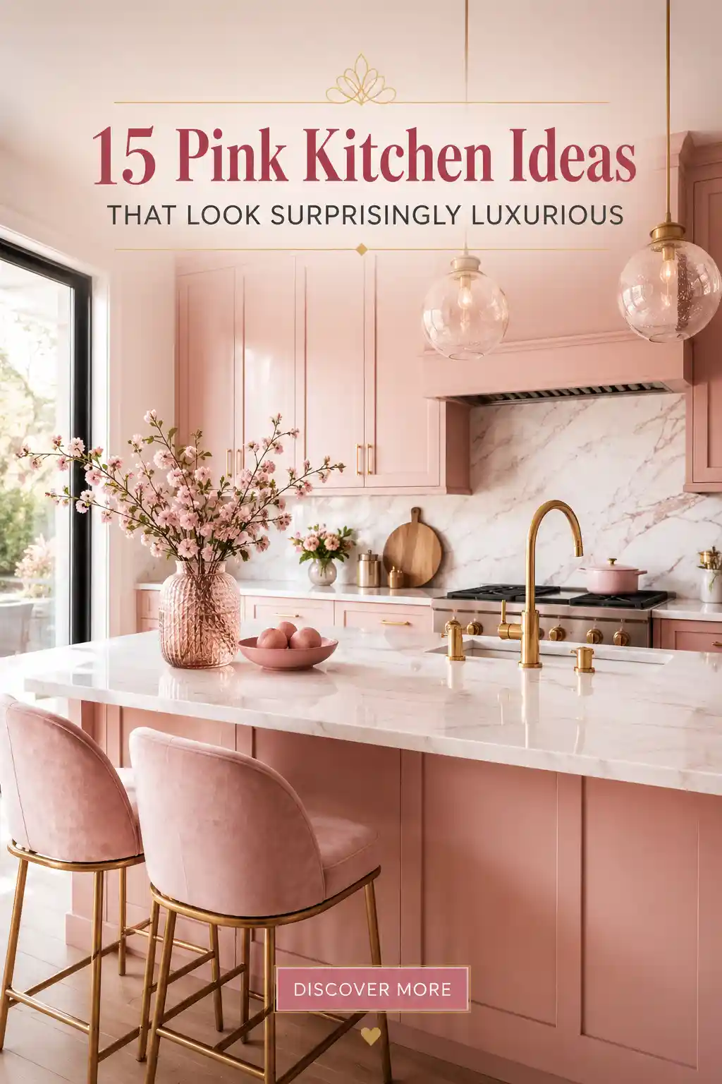
Move over, neutral whites and grays. Adding pink to your kitchen is a bold design move that brings warmth, personality, and a touch of luxury to the heart of the home. Whether you prefer a barely-there blush or a high-energy magenta, pink can be adapted to suit any style from mid-century modern to ultra-contemporary. In this guide, we explore fifteen unique ways to integrate pink hues into your culinary space, helping you create a welcoming environment that inspires creativity and joy every time you cook.
Dusty Rose Sophistication
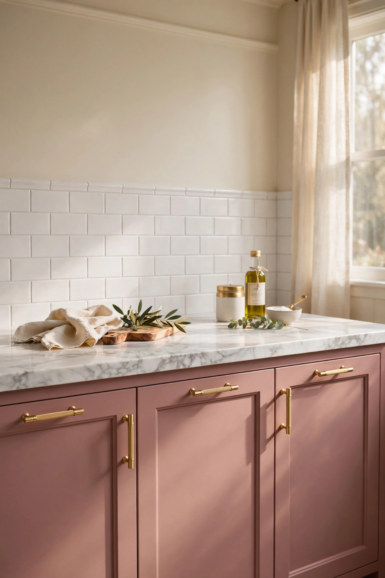
Dusty rose is the perfect entry point for those who want to introduce color into their home decor without committing to something overly bright. This muted, earthy pink provides a sophisticated backdrop that feels timeless rather than trendy. By pairing these soft tones with brushed gold hardware and creamy white surfaces, you create a space that feels warm and inviting. To keep the look balanced, utilize matte finishes on the cabinetry to prevent the color from feeling too sugary, ensuring the kitchen remains a polished and mature environment for cooking and gathering.
Champagne Pink Glamour
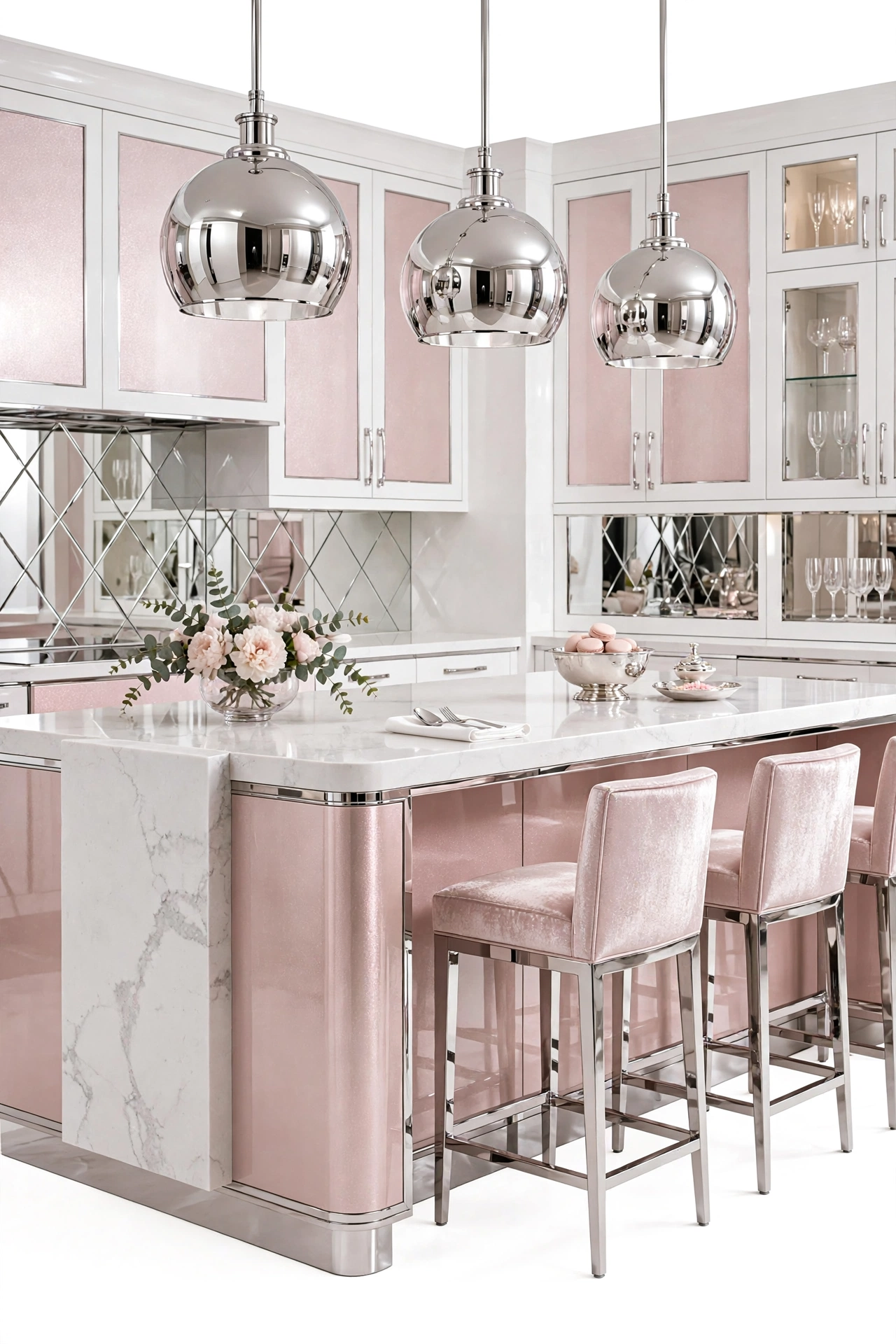
For a look that screams luxury, champagne pink offers a luminous quality that brightens any room. This palette works exceptionally well when combined with reflective materials like polished chrome, mirrored surfaces, and high-gloss lacquer. The goal here is to play with light; the shimmer of the pink tones reflects the surrounding brightness, making the kitchen feel larger and more opulent. To avoid over-decorating, stick to a minimal color palette of pink, white, and silver, allowing the high-end materials to provide the necessary visual interest and depth.
Neon Magenta Modernism
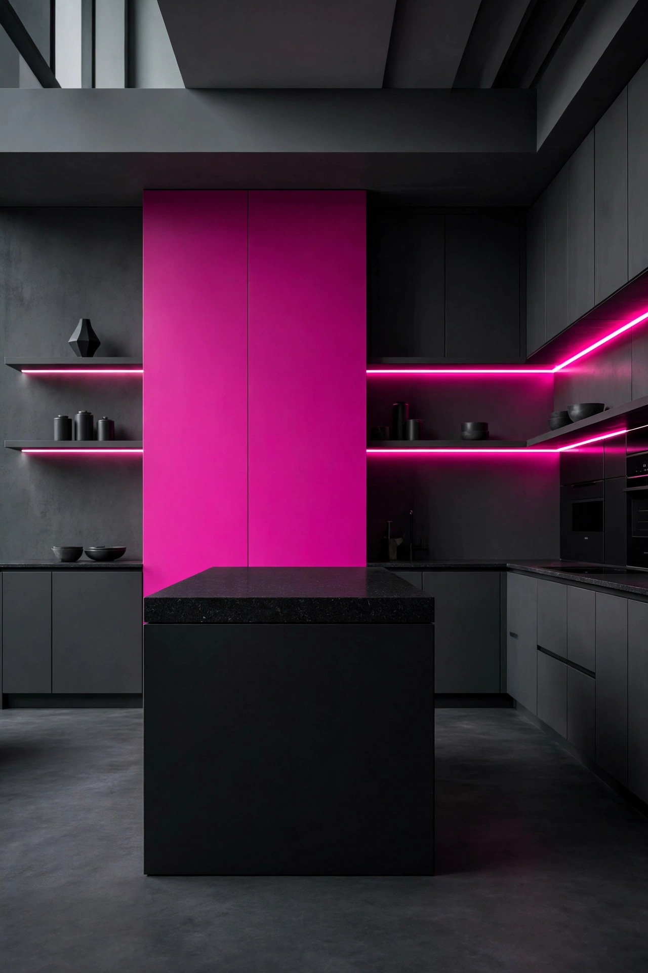
If you view your kitchen as a gallery of personal expression, neon magenta is a daring choice that makes a powerful statement. This high-energy hue works best when contrasted with deep, grounding neutrals like matte black or charcoal grey. By limiting the magenta to a single focal point—such as an accent wall or a bold island—you create a visual anchor that energizes the entire room. This approach transforms the culinary space into a modern hub of creativity, blending an edgy urban vibe with the functional requirements of a residential kitchen.
Pale Peach Harmony
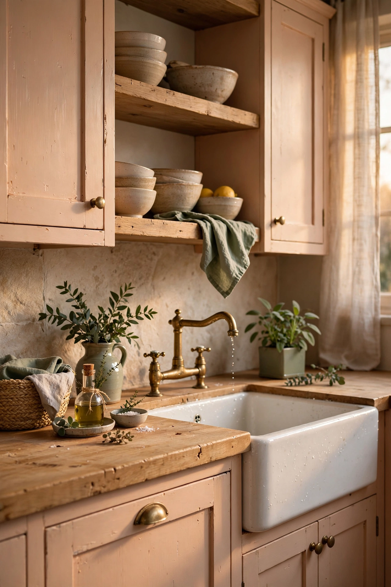
Pale peach is a wonderful alternative to traditional pink, offering a warmer, sun-kissed glow that evokes a sense of permanent springtime. This color pairs beautifully with natural textures, particularly light-toned woods like oak or ash. By integrating elements of nature—such as indoor herbs in sage green pots or a chunky butcher block island—you can ground the lightness of the peach tones. The result is a harmonious, serene environment that feels cozy and organic, making it an ideal choice for those who love a cottage-core or rustic-modern aesthetic.
Blush and Marble Minimalism
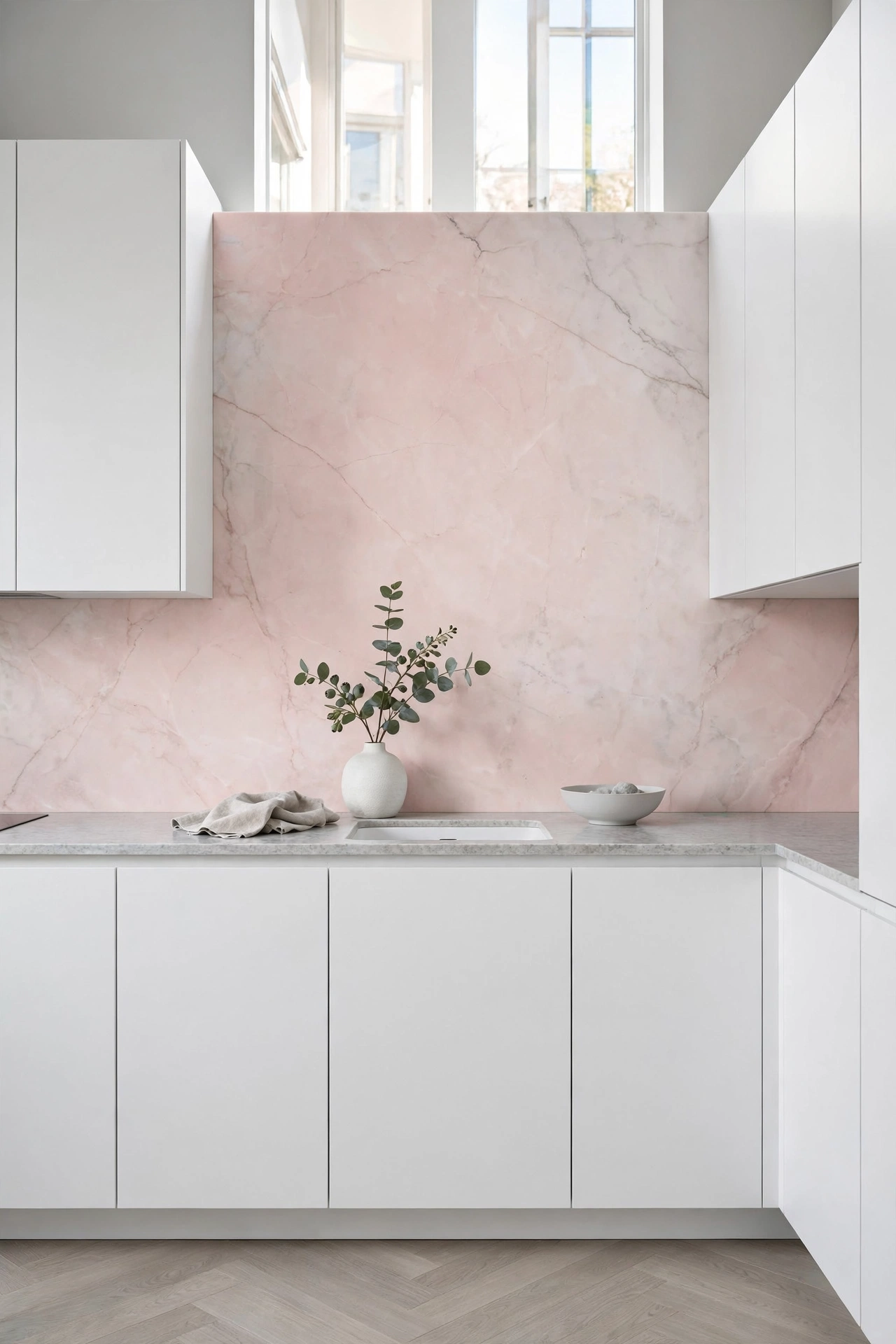
Minimalism doesn’t have to mean a lack of color. A blush and marble combination provides a clean, airy aesthetic that feels fresh and contemporary. The key to this look is the balance between the softness of the pink and the coolness of the white marble. By using a blush-toned backsplash or a few subtle pink accents, you add a layer of warmth to an otherwise stark environment. This design approach focuses on quality over quantity, utilizing a few high-end materials and a restricted color palette to achieve a sophisticated, uncluttered look.
Terracotta Pink Rustic
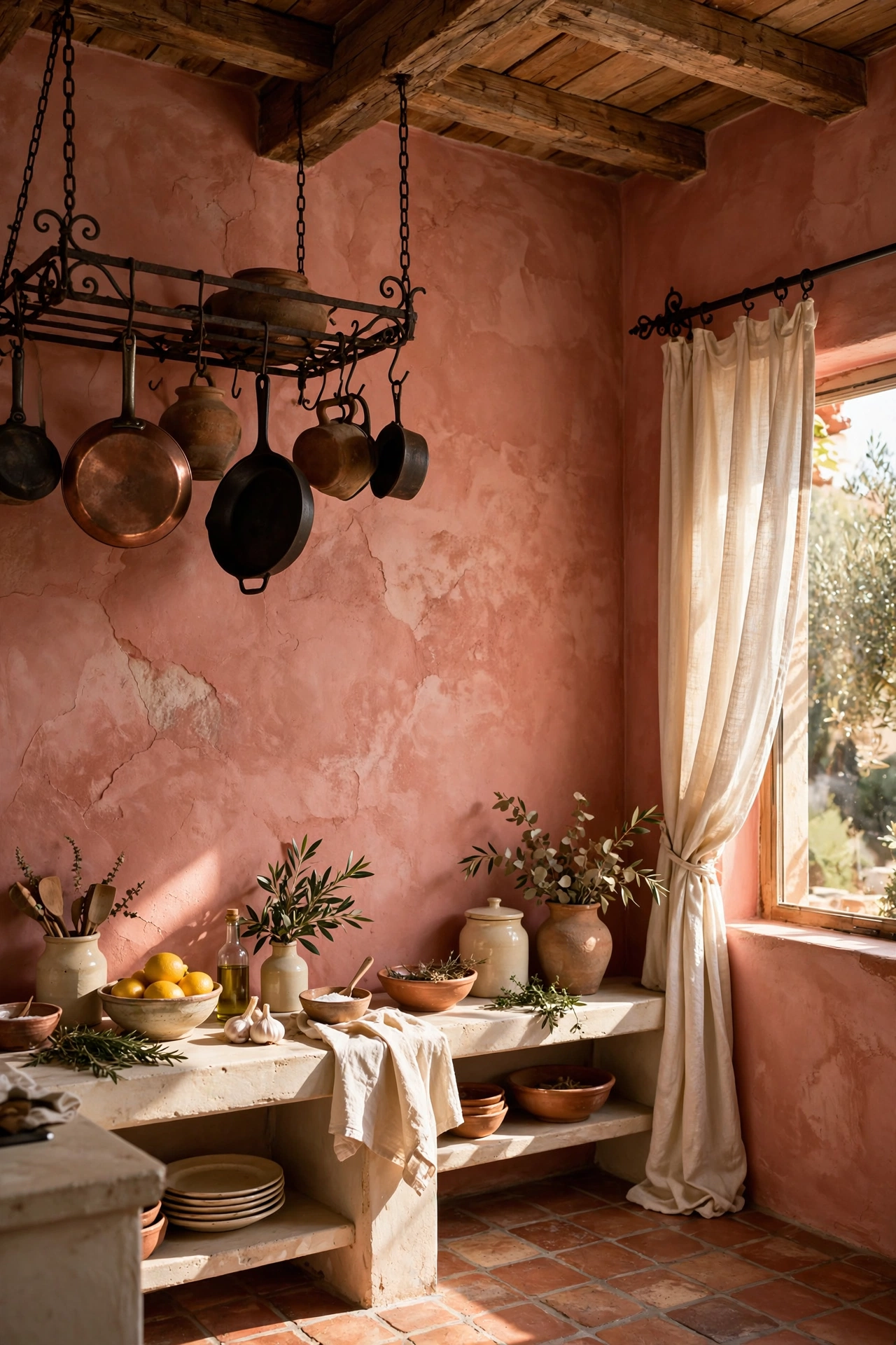
Drawing inspiration from Mediterranean architecture, terracotta pink brings an earthy, grounded energy to the kitchen. This isn’t a sugary pink, but rather a deep, sun-baked hue that feels historical and authentic. Pairing these walls with raw materials like clay tiles and wrought iron accents enhances the rustic charm. This style celebrates imperfection and texture, making the kitchen feel lived-in and welcoming. It is an excellent choice for homeowners who want a color-rich space that feels connected to the earth and traditional craftsmanship.
Pastel Pink Retro Revival
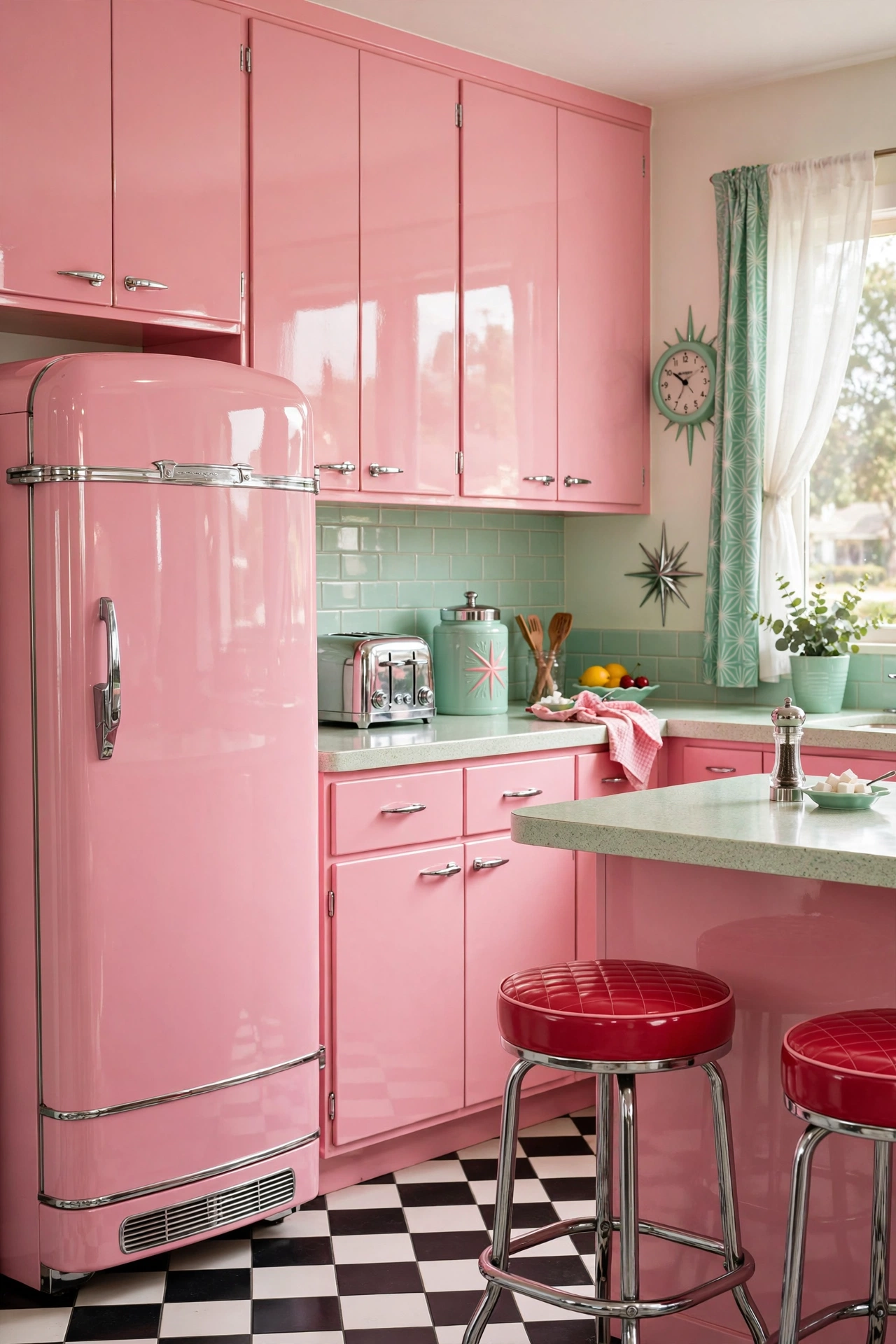
For those who love a vintage vibe, a pastel pink retro kitchen is a playful and nostalgic choice. This look is all about high contrast and high gloss. Pairing bubblegum pink cabinets with mint green accents and polished chrome hardware creates a vibrant, energetic atmosphere reminiscent of a 1950s diner. To keep this look from feeling like a movie set, integrate a few modern appliances in matching retro colors. This blend of nostalgic charm and modern functionality creates a spirited space that is guaranteed to be a conversation starter.
Mauve Moody Atmosphere
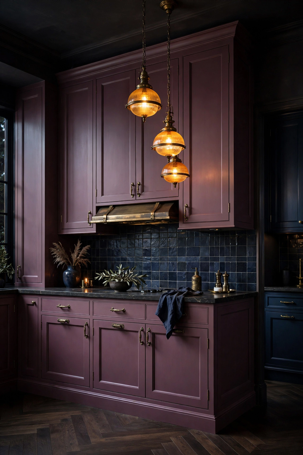
Mauve offers a deeper, more mysterious take on the pink spectrum, leaning into purple and grey undertones. When used in a moody kitchen design, mauve creates a sense of intimacy and luxury. By pairing this deep shade with dark soapstone counters and antique brass fixtures, you achieve a dramatic look that feels like a high-end lounge. This palette is ideal for larger kitchens with high ceilings where dark colors won’t feel claustrophobic, instead adding a layer of richness and sophistication to the home’s overall decor.
Strawberry Quartz Shine
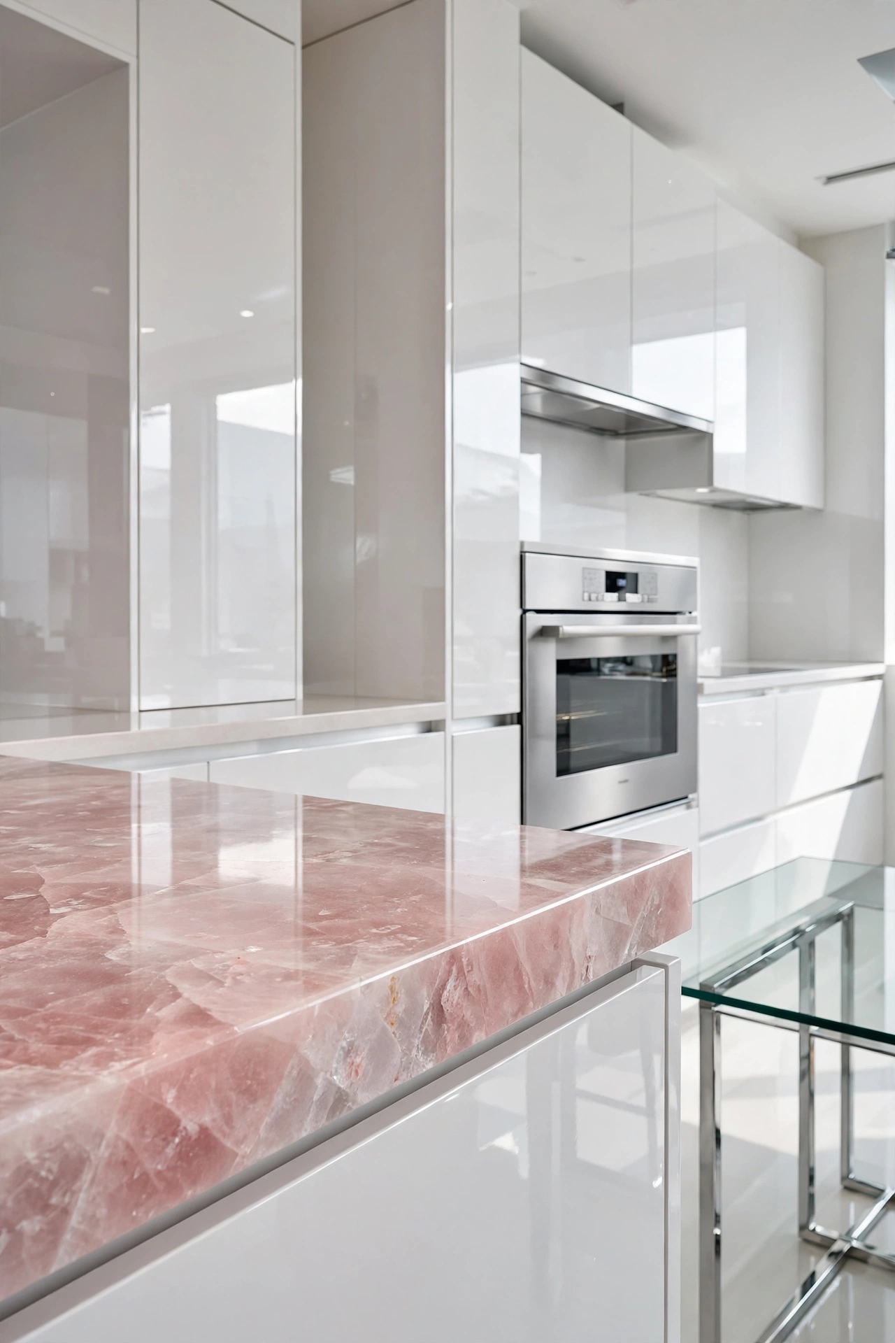
Strawberry quartz provides a unique opportunity to incorporate pink through materials rather than paint. The semi-translucent, crystalline nature of pink quartz adds a layer of depth and shimmer to the kitchen island or countertops. When paired with high-gloss white lacquer cabinetry, the pink quartz becomes the undisputed star of the room. This design is perfect for those who prefer a clean, futuristic aesthetic where the color is integrated into the architecture of the space, providing a polished and expensive feel.
Rosewater Serenity
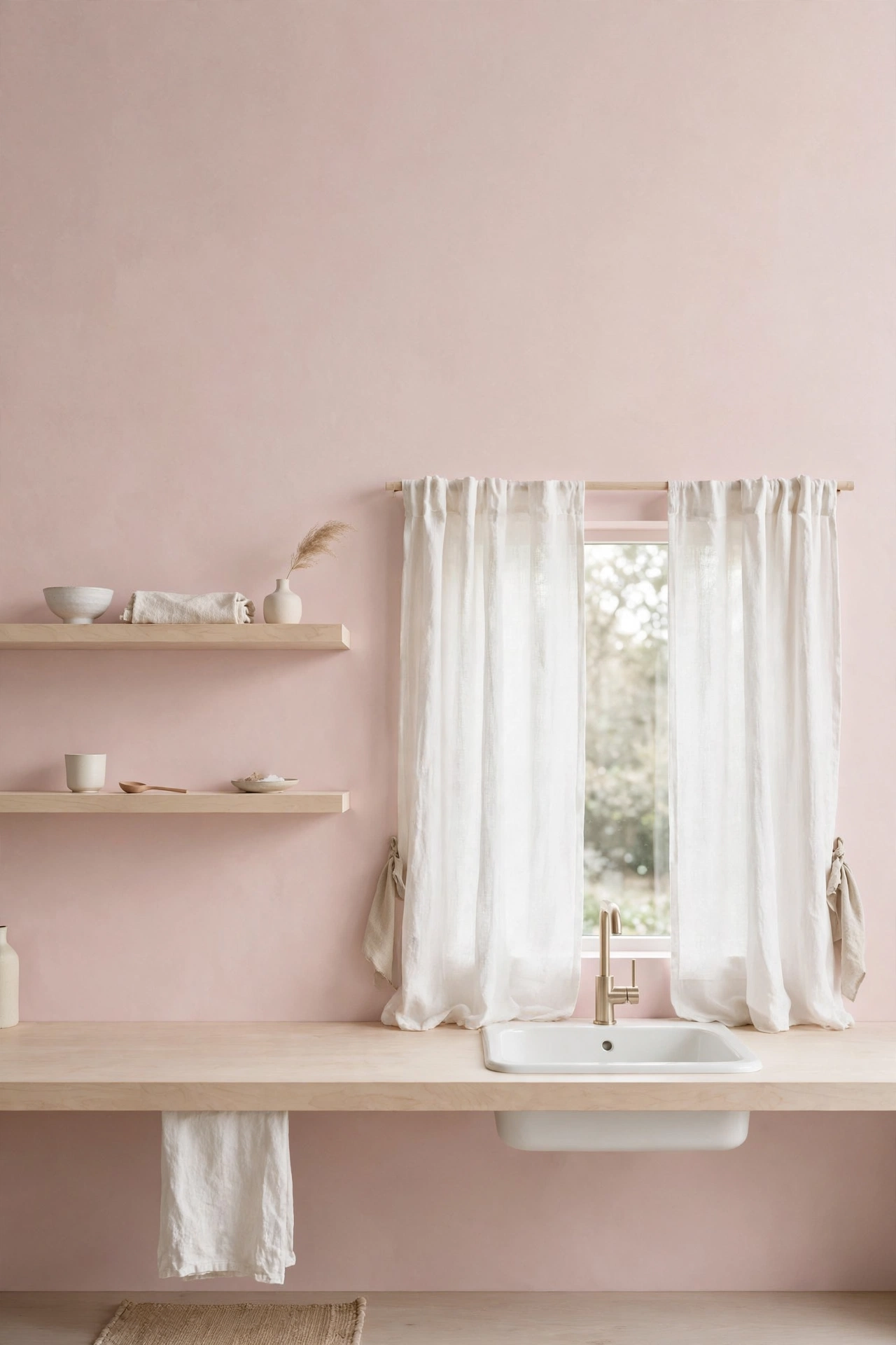
Rosewater serenity is all about the beauty of the ‘almost white.’ This shade of pink is so delicate that it functions as a neutral, providing just a hint of warmth to the space. To maintain this peaceful atmosphere, lean into a Zen-inspired palette of white linen and light birch wood. The goal is to create a space that feels like a breath of fresh air, where the soft pink tones promote a sense of calm and wellness. This approach is ideal for small kitchens, as the light colors open up the space visually.
Coral Punch Energy
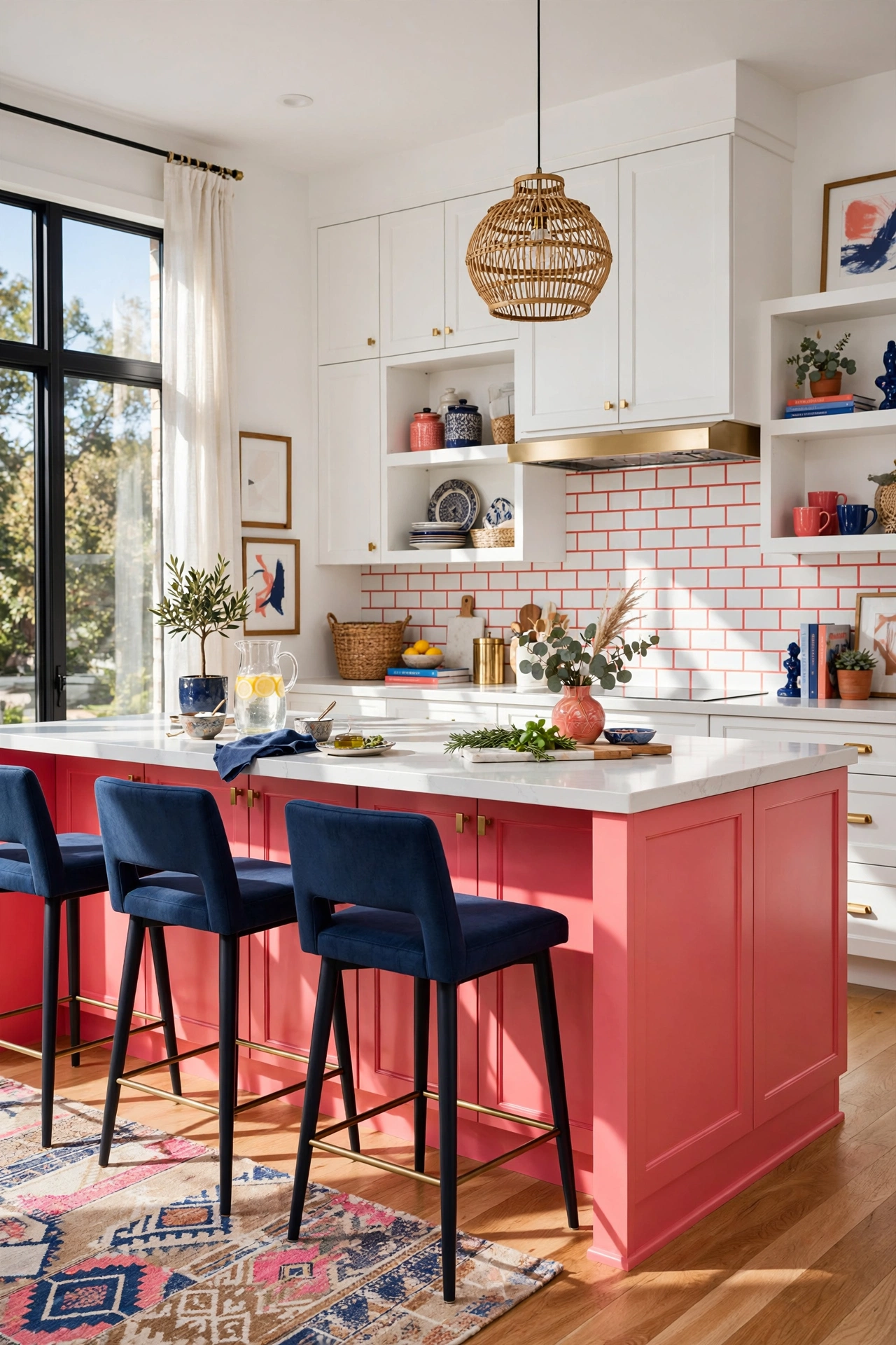
Coral is an energetic blend of pink and orange that brings a tropical, vibrant energy into the home. To prevent this bold color from becoming overwhelming, use it strategically on the lower cabinetry while keeping the upper walls and cabinets a crisp, clean white. Adding a contrasting accent color, such as navy blue, provides a sophisticated anchor that prevents the coral from feeling too sweet. This combination is perfect for homeowners who want a high-energy space that feels cheerful, modern, and full of life.
Salmon Pink Transitional
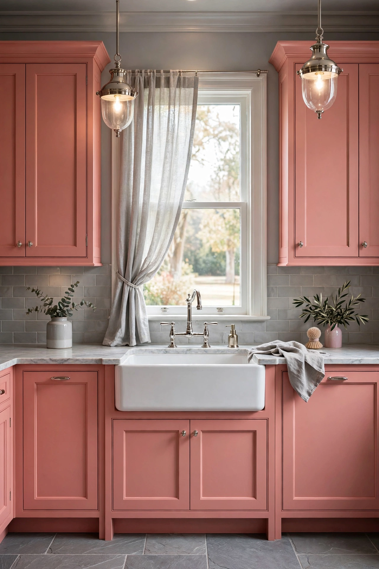
Transitional design is all about the balance between traditional and modern, and salmon pink is the ideal hue for this middle ground. By using classic shaker-style cabinets in a soft salmon tone, you maintain a traditional structure while introducing a modern color twist. Pairing this with soft grey floors and polished nickel hardware keeps the look grounded and elegant. This design is a great choice for those who want a kitchen that feels current but will still feel appropriate and stylish ten years from now.
Magenta Accent Focal Point
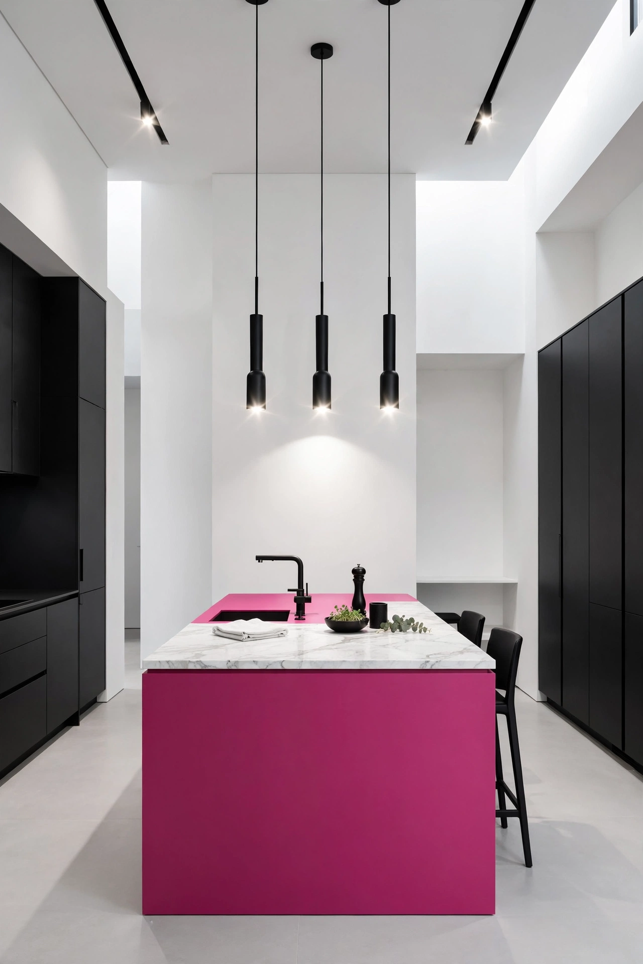
For those who are hesitant to paint their entire kitchen pink, the ‘focal point’ strategy is the perfect solution. By painting only the kitchen island a deep magenta, you create a stunning architectural statement without overwhelming the rest of the room. Surround the bold island with a neutral palette of stark whites and matte blacks to make the pink pop. This high-contrast approach is visually stimulating and sophisticated, proving that a small amount of a bold color can have a massive impact on the overall home decor.
Cherry Blossom Softness
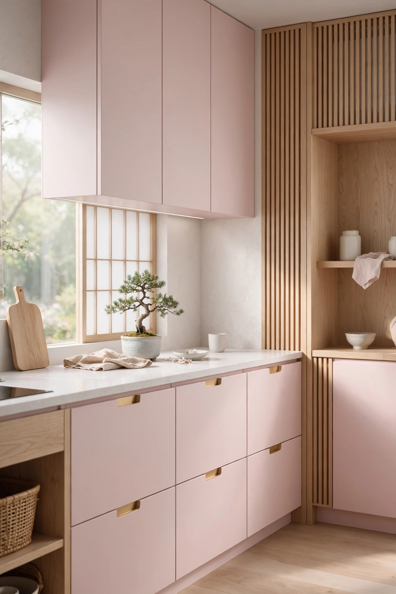
Inspired by the ephemeral beauty of spring in Japan, the cherry blossom aesthetic focuses on delicacy and light. Using a very pale, cool-toned pink for the cabinetry creates a sense of fragility and grace. When paired with the warmth of light oak wood and the purity of soft white surfaces, the kitchen becomes a sanctuary of peace. This design emphasizes the connection between the indoors and outdoors, making the cooking process feel more mindful and serene, which is a hallmark of high-end minimalist home decor.
Peppermint Pink and Teal
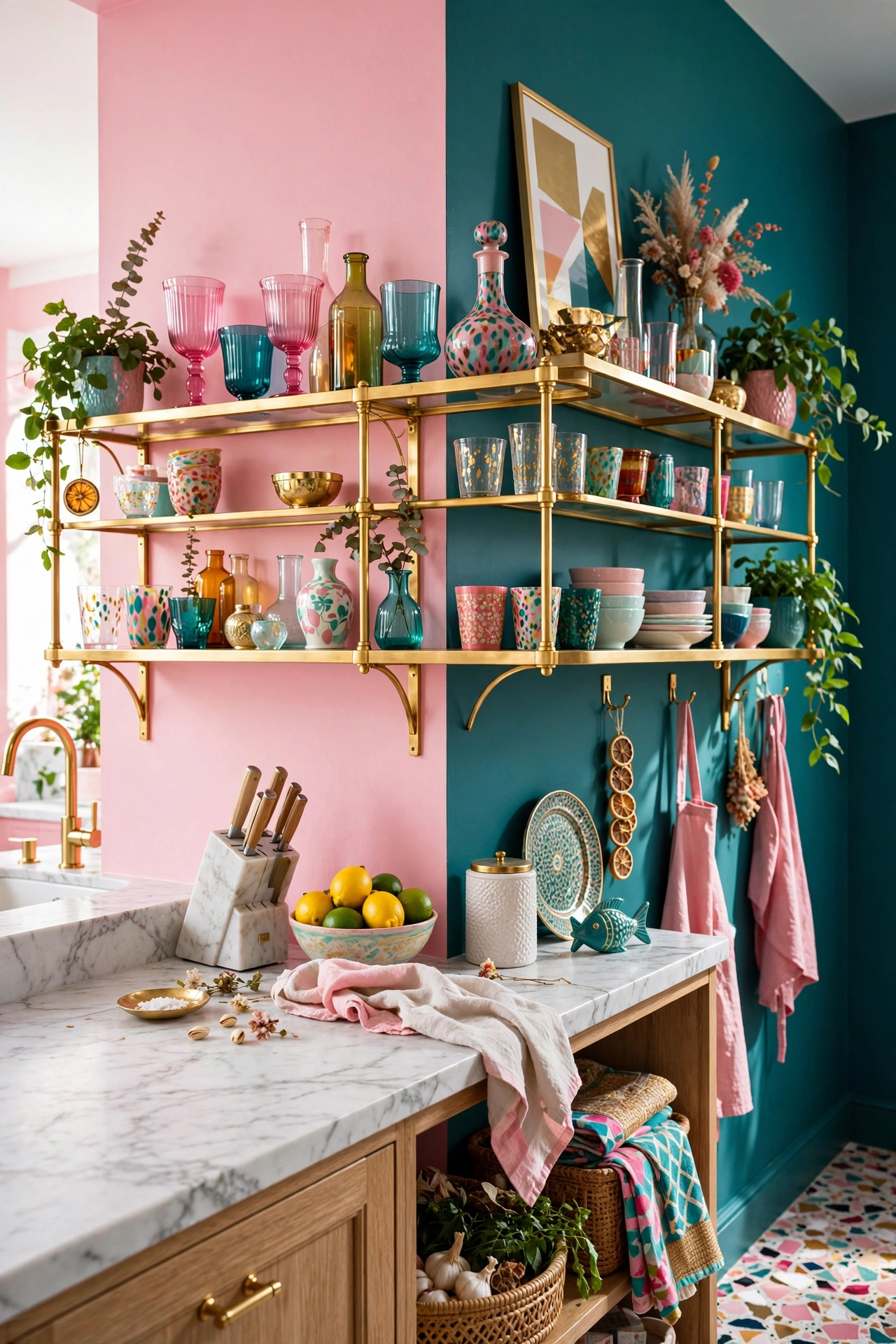
Maximalism is about embracing bold combinations, and peppermint pink paired with deep teal is a masterclass in color theory. These two colors sit in a complementary relationship that creates a vibrant, artistic tension. To tie the look together, use gold shelving and white marble surfaces to add a touch of luxury and brightness. This eclectic approach is for the homeowner who isn’t afraid of color and wants their kitchen to reflect a playful, creative, and unapologetically bold personality.