

Creating a sanctuary for rest starts with a thoughtful color palette. The right hues can lower stress and prepare your mind for deep sleep. Whether you prefer warm neutrals or cool tones, selecting the best colors for a relaxing bedroom is about balancing mood and aesthetics. In this guide, we explore 14 curated color schemes and design ideas to turn your sleeping quarters into a peaceful retreat.
Warm Oat and Cream Neutrals
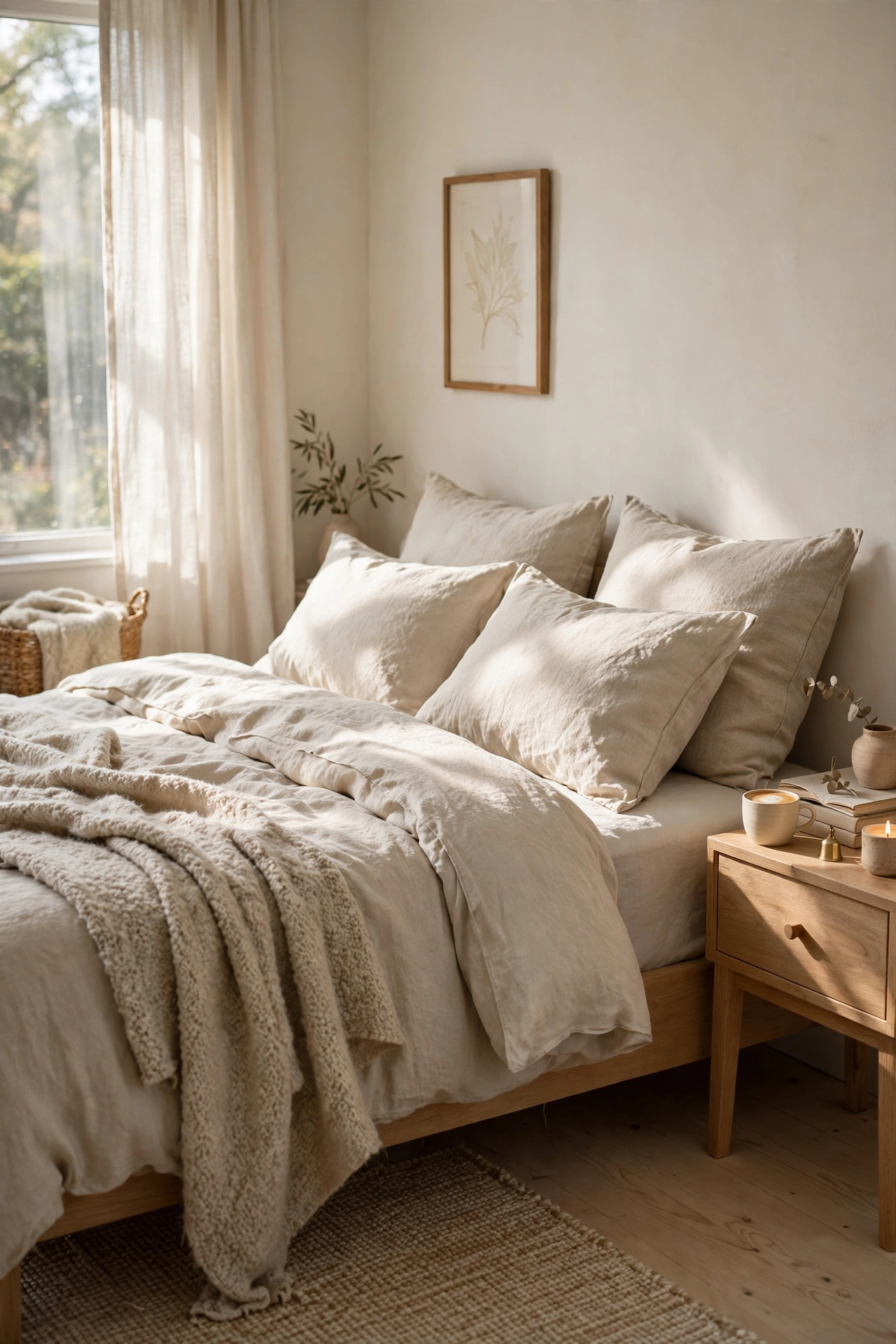
Embracing a palette of warm oat and cream is one of the most effective ways to instill a sense of immediate calm in your bedroom. These soft, neutral tones remove visual noise and create a clean, airy atmosphere that feels like a warm embrace. To prevent the room from feeling flat, focus on layering different textures. Combine a chunky knit throw with smooth cotton sheets and a linen duvet. This tactile variety adds depth and sophistication, making the space feel curated and cozy rather than sterile, which is essential for a restful environment.
Serene Sage and Sandy Beige
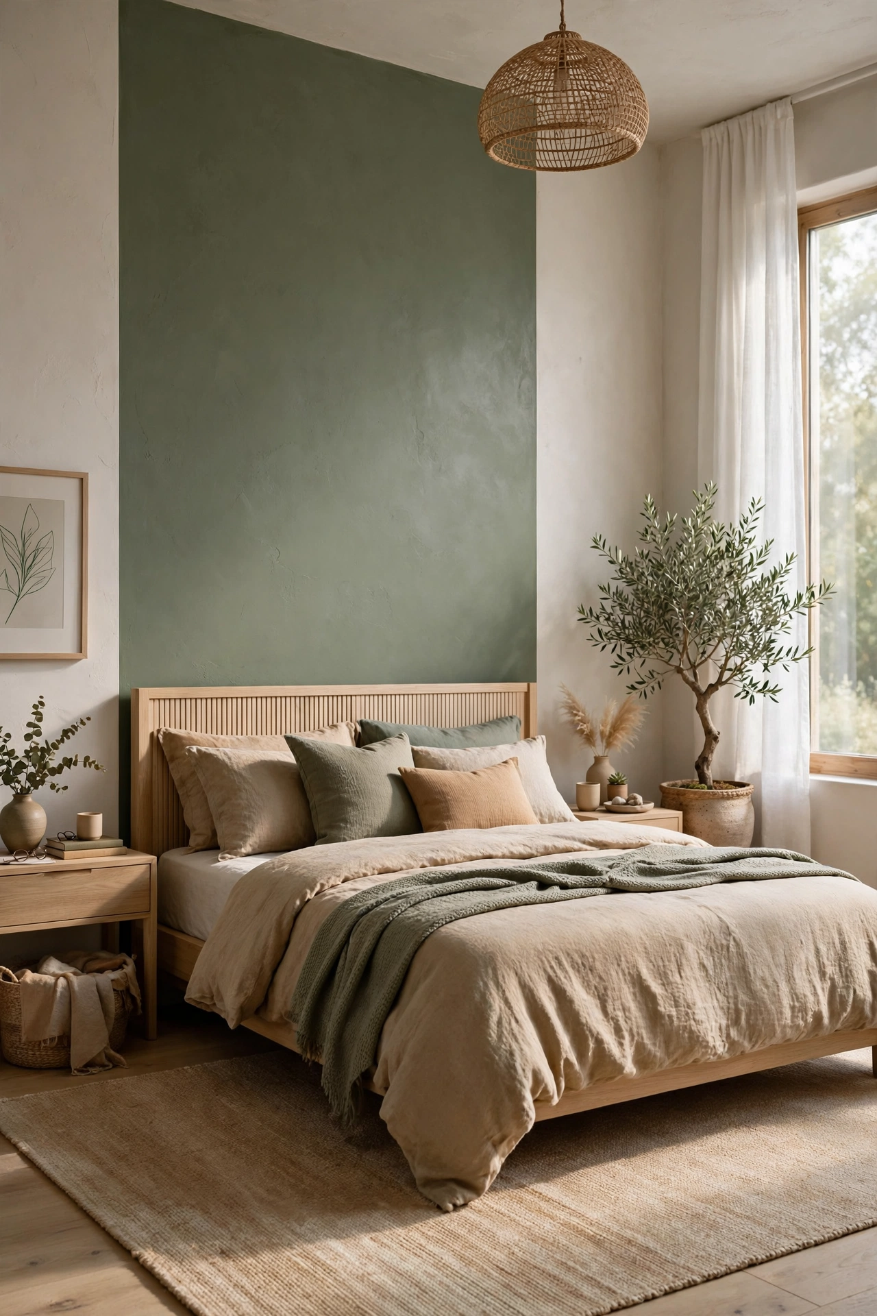
Bringing the outdoors inside is a proven method for reducing stress, and a combination of sage green and sandy beige does exactly that. Sage acts as a bridge between warm and cool tones, offering a muted, earthy energy that is naturally soothing to the eyes. When paired with sandy beiges, the room takes on a grounded, organic feeling reminiscent of a quiet forest or a secluded shoreline. This palette encourages a slower pace of life and helps you disconnect from the digital world as you prepare for sleep.
Classic Dusty Blue and Crisp White
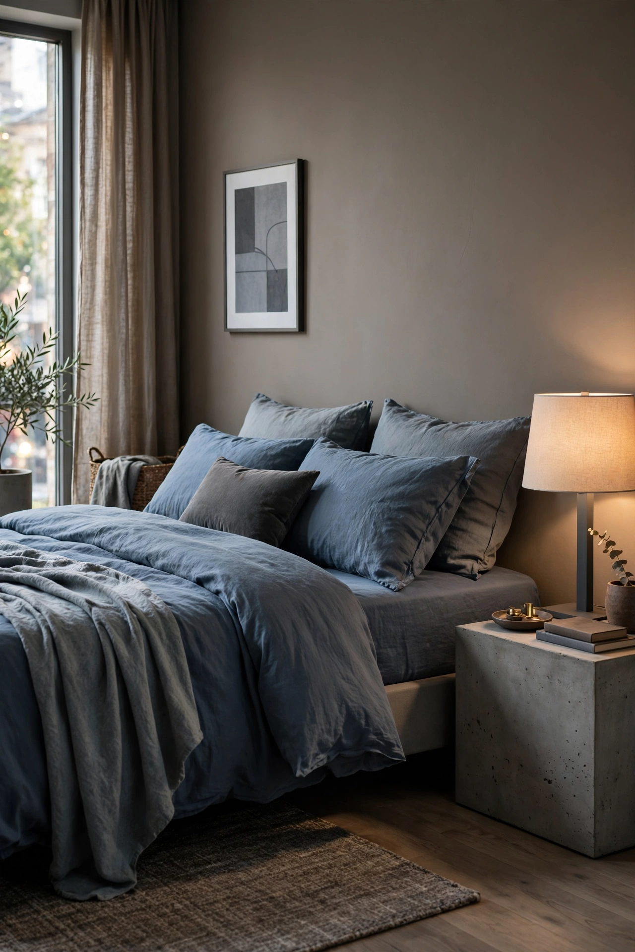
Blue is widely regarded as the most relaxing color for the bedroom due to its association with the sky and the sea. However, to avoid a space that feels too cold, opt for a dusty or muted blue rather than a primary shade. Pairing this soft hue with crisp white linens creates a breathable, airy atmosphere that feels fresh and rejuvenating. This classic coastal-inspired combination is perfect for those who want a bedroom that feels like a permanent vacation, promoting a sense of serenity and mental clarity.
Romantic Blush and Ivory
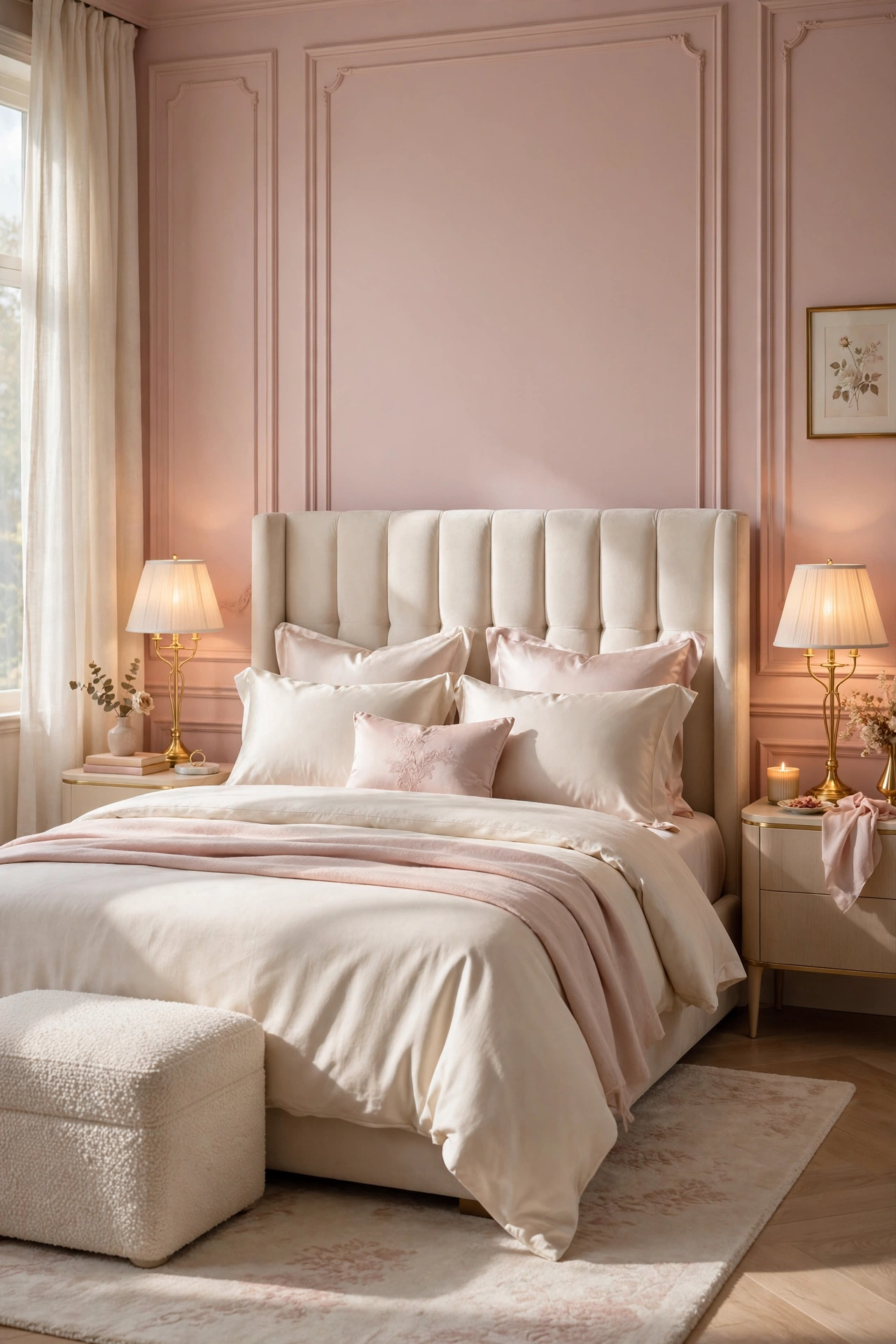
For a bedroom that feels nurturing and soft, a combination of blush and ivory is an excellent choice. When blush is used in a muted, sophisticated tone, it adds a layer of romance and warmth without becoming overwhelming. Pairing it with ivory instead of stark white prevents the room from feeling too clinical, adding a touch of luxury and softness. This palette is especially effective when combined with plush textures like velvet or silk, creating a gentle environment that encourages winding down and emotional relaxation.
Moody Charcoal and Soft Gray
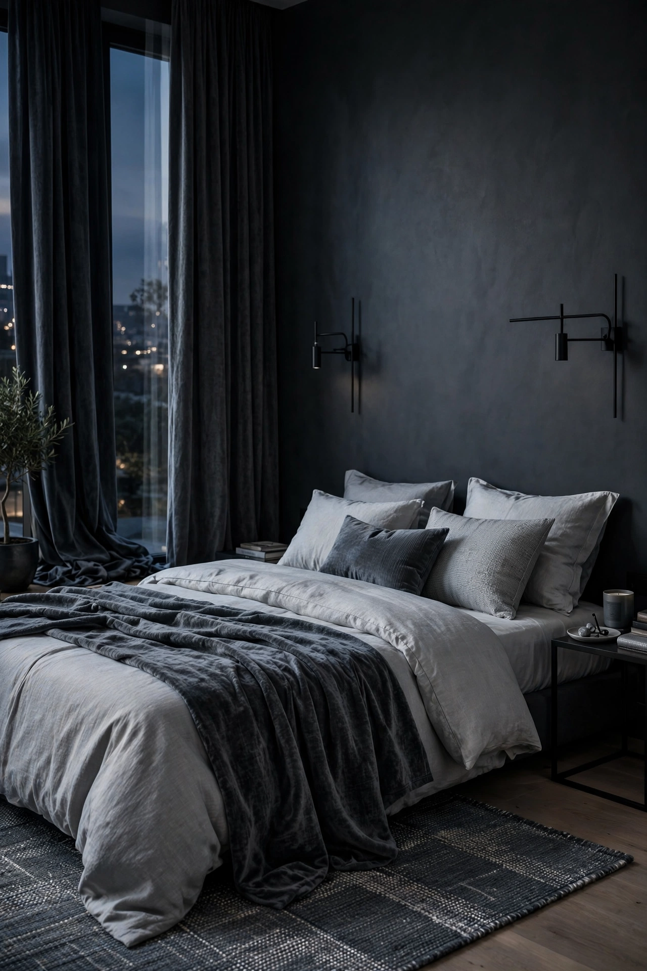
While many people gravitate toward light colors, a moody charcoal palette can create a powerful ‘cocoon’ effect that is incredibly soothing for light sleepers. Deep tones provide a sense of security and quiet, mimicking the natural darkness of nighttime. The key to making this work is to balance the dark walls with softer gray textiles and warm, layered lighting. This high-contrast yet monochromatic approach creates a sophisticated, hotel-like atmosphere that feels private and sheltered from the outside world.
Earthy Terracotta and Warm Beige

Terracotta brings a grounded, ancestral energy to the bedroom, evoking the warmth of the earth. By pairing this rich, clay-like hue with neutral beiges, you achieve a perfect balance between vibrant warmth and quiet serenity. This palette is ideal for those who want their bedroom to feel cozy and stable. To enhance the effect, incorporate organic materials such as jute rugs, rattan chairs, and unfinished wood, which complement the earthy tones and reinforce the connection to nature.
Lavender Mist and Soft White
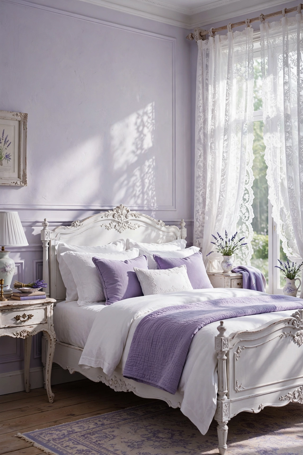
Lavender is well-known for its calming aromatherapy properties, and the color itself can have a similar effect on the mind. A pale ‘misty’ lavender avoids looking too juvenile, instead offering a sophisticated and ethereal quality. When combined with soft white, the room feels weightless and dreamy. This is a wonderful choice for those looking to introduce a hint of color while maintaining a peaceful, low-stimulation environment that promotes deep, uninterrupted sleep.
Deep Navy and Gold Accents
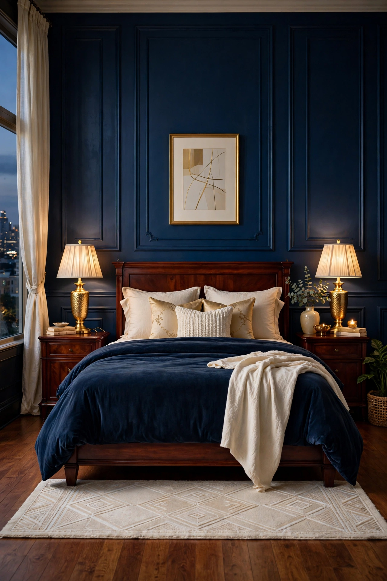
Navy blue is a timeless choice for creating a sense of order and tranquility in a master suite. To prevent the deep blue from making the room feel too dark or heavy, integrate shimmering gold accents and light cream fabrics. The contrast between the depth of the navy and the brightness of the gold adds a touch of luxury and elegance without sacrificing the calming nature of the blue. This palette is sophisticated and commanding, yet remains fundamentally restful.
Olive Green and Warm Walnut
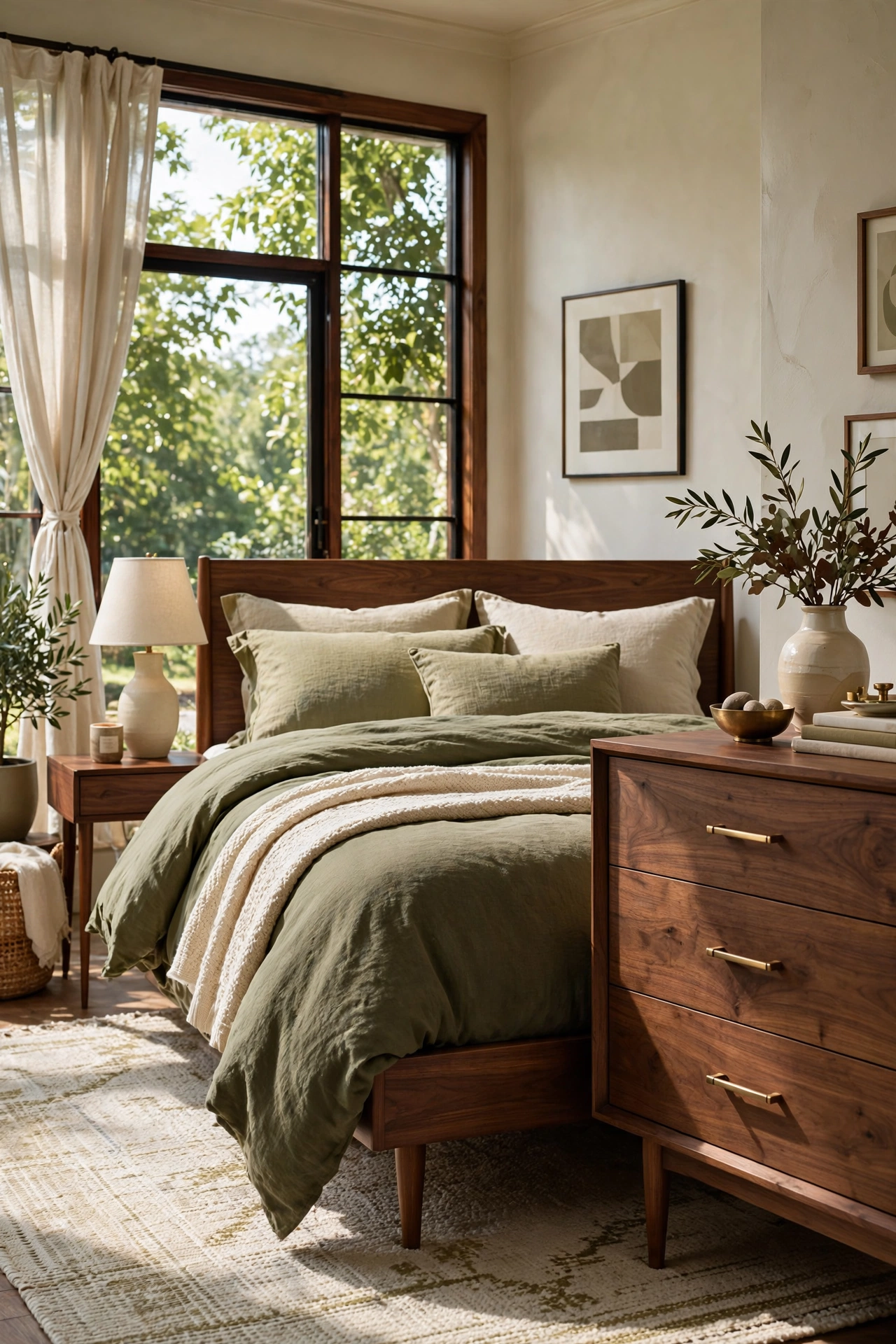
Olive green is a sophisticated neutral that brings a sense of maturity and peace to the bedroom. Pairing it with the rich, warm tones of walnut or teak wood creates a harmonious, organic vibe that feels both timeless and modern. This combination encourages a slower pace of life and helps the mind disconnect from the stresses of the day. It works exceptionally well in rooms with plenty of natural light and indoor plants, further enhancing the calming, biophilic design.
Monochrome Greige and Natural Linen
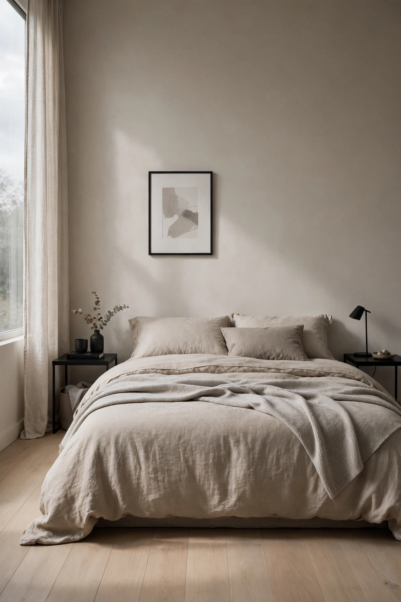
Greige—the perfect intersection of gray and beige—is the ultimate choice for a modern, relaxing bedroom. It eliminates the coldness of pure gray and the yellow undertones of traditional beige, resulting in a versatile neutral that adapts beautifully to any lighting condition. By using a monochrome approach with varying linen textures, you create a visually quiet space. This lack of high-contrast color helps eliminate mental clutter, allowing the mind to drift easily into a state of relaxation.
Soft Mint and Pale Peach
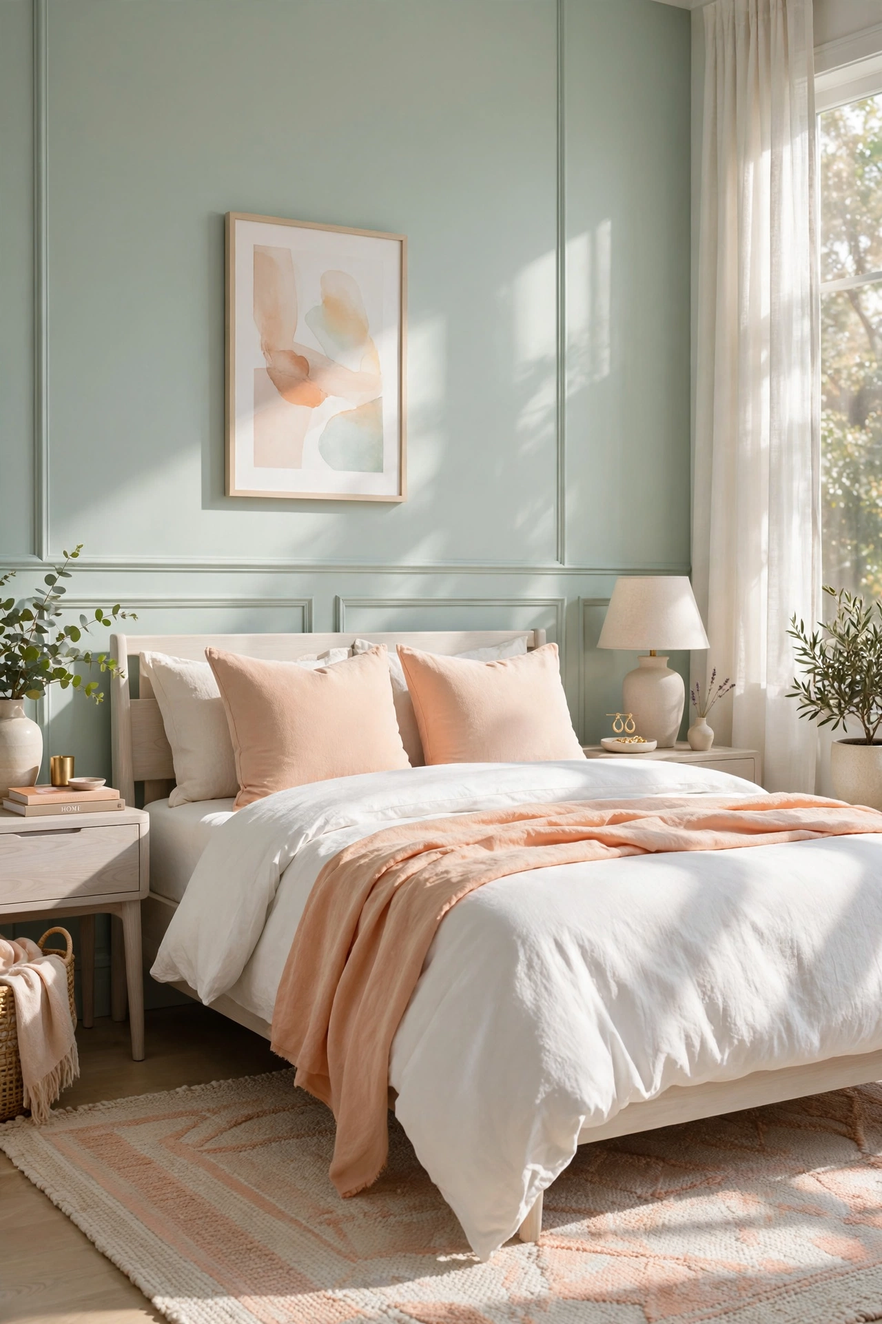
For a bedroom that feels both refreshing and comforting, consider a muted pairing of soft mint and pale peach. This complementary combination mimics the colors of a spring sunrise, bringing a gentle energy into the room. Mint provides a cooling, crisp effect, while peach adds a touch of warmth and friendliness. Together, they create a cheerful yet serene environment that is uplifting during the day but remains quiet enough to support a restful night’s sleep.
Slate Blue and Warm Taupe
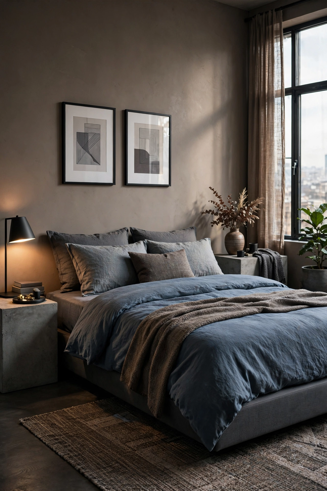
Slate blue is a sophisticated, grayish-blue that feels stable and calm. Pairing it with taupe—a warm, brownish-gray—creates a balanced environment where neither the warm nor the cool tones dominate. This combination is particularly effective in urban settings, providing a serene escape from the hustle and bustle of city life through its understated elegance. The muted nature of these colors prevents overstimulation, making it an ideal choice for a high-stress lifestyle.
Chocolate Brown and Rich Cream
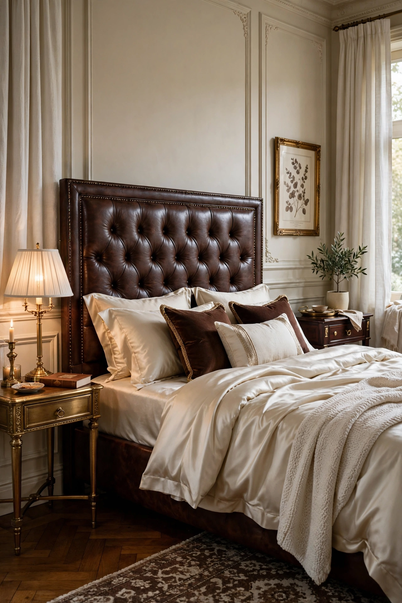
Rich chocolate brown is making a strong comeback as a grounding color for the bedroom. When paired with luxurious cream textiles, it creates a high-contrast look that feels enveloping and secure. This palette is reminiscent of high-end boutique hotels, offering a sense of indulgence and comfort. The depth of the brown provides a feeling of stability, while the cream prevents the space from feeling too heavy, resulting in a room that feels both opulent and deeply relaxing.
Ethereal White and Silver Accents
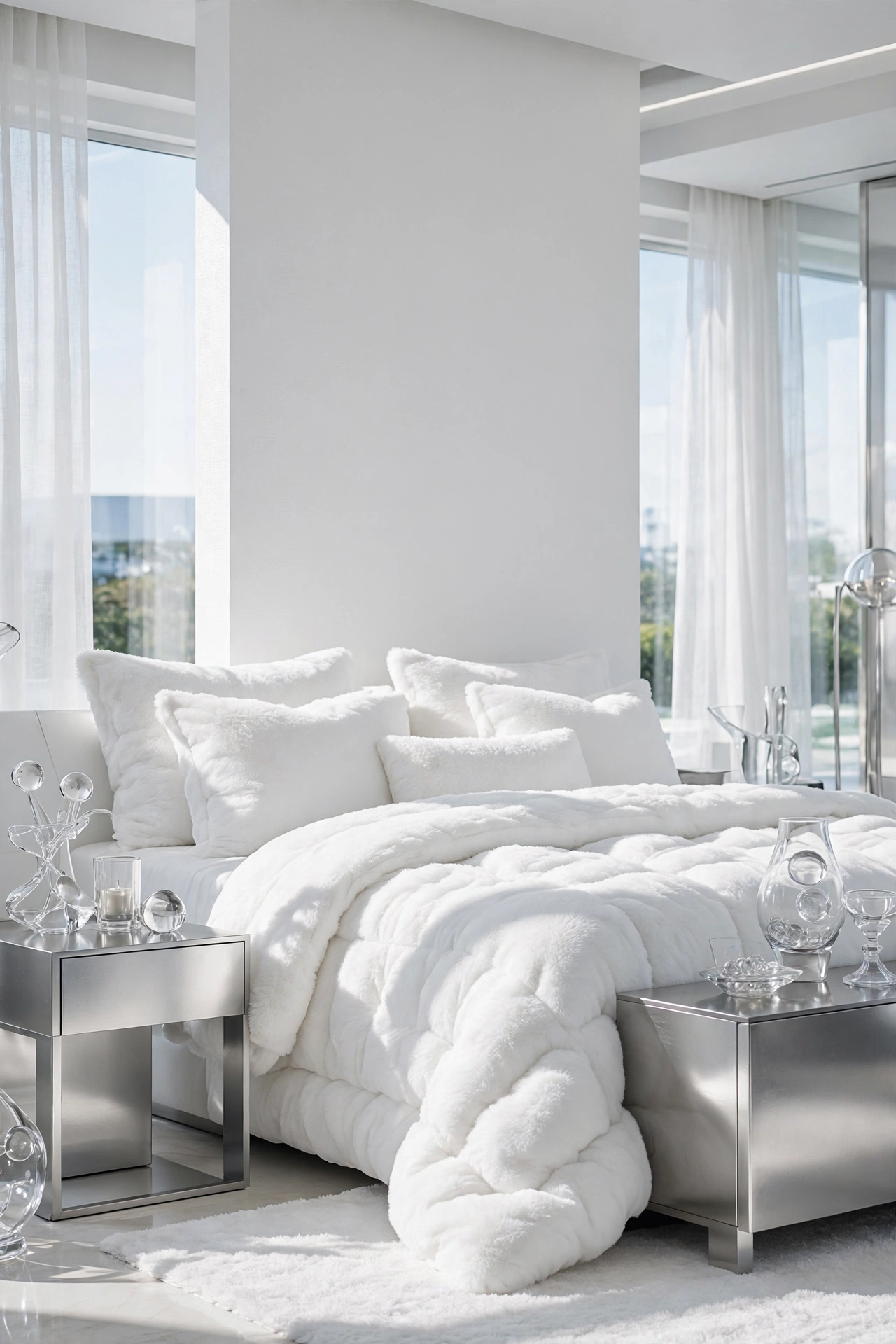
A completely white room can sometimes feel stark, but by adding silver accents and varying shades of off-white, you can create an ethereal, cloud-like sanctuary. This palette maximizes natural light, making the room feel expansive and clean. It is the ideal choice for those who desire a ‘blank slate’ environment to clear their mind before sleep. The combination of white and silver evokes a sense of purity and peace, turning the bedroom into a weightless retreat.