
10 Japandi Kids Room Ideas for a Simple, Sweet Space
Welcome to the world of Japandi Kids’ Rooms, where the “organized chaos” of childhood meets the intentional peace of minimalist design. If you’ve ever felt overwhelmed by primary colors and plastic toys, Japandi is your antidote.
the Japanese philosophy of Wabi-sabi (finding beauty in imperfection), you create a space that doesn’t just look like a magazine spread—it actually helps your child feel focused and calm.
The Japandi Foundation for Kids
The goal here is a “peaceful playground.” We are trading high-contrast clutter for soft neutrals, tactile natural materials, and smart, low-profile furniture that grows with your child. In a Japandi room, every object has a “home,” and every texture has a purpose.
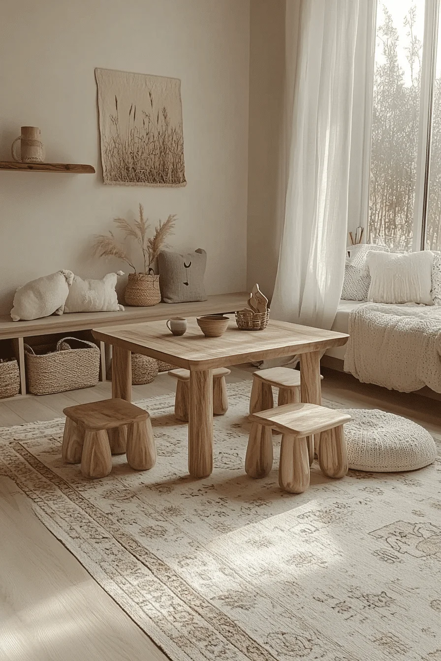
1. Japandi Calm Play Space
This is the ultimate blueprint for a “sensory reset.” In a world of flashing toys and loud colors, this room acts as a physical deep breath. By focusing on the floor—where kids actually spend 90% of their time—you turn the entire room into a high-functioning landscape for the imagination.
The power of this layout is in its unobstructed horizontal lines. By keeping furniture close to the earth, the room feels massive, airy, and safe. It trusts children to engage with their environment on their own level, fostering independence and a sense of calm “ownership” over the space.
The “Anatomy” of the Design
To achieve this level of zen-like functionality, you have to prioritize flow over “stuff”:
The Canvas: Use a color like Sherwin-Williams Natural Linen. It’s a soft, toasted neutral that feels like a warm hug. It provides enough warmth to feel cozy (Scandi) while staying clean enough to feel minimalist (Japan).
The Foundation: A low floating wooden bench. This is a Japandi powerhouse—it provides a seat, a stage for building blocks, and hidden storage for “clutter” all in one sleek line.
The Light: Skip the bulky lamps. Recessed warm LEDs keep the ceiling line “clean,” ensuring the vertical space feels infinite and free of distractions.
The Texture Hierarchy
In a minimalist room, “tactile variety” is what makes it feel like a home rather than a gallery:
The Natural: Bleached oak and rattan weave details provide a sturdy, organic backbone.
The Soft: Oversized round floor cushions in raw linen. These are the “mobile” furniture of the room, allowing kids to set up a reading nook or a fortress anywhere they want.
The Grounding: A handwoven jute rug to add a gritty, earthy texture that anchors the play zone.
★ Steal This Look
Paint Color: Sherwin-Williams Natural Linen SW 9109
Furniture: Floor-level open shelving; low floating bench; linen floor cushions.
Lighting: Warm dimmable recessed spotlights; sheer vertical window treatments.
Materials: Bleached oak, jute, rattan, and unglazed ceramic.
🔎 Pro Tip: The “Rug Layering” Zone Hack
To keep an open floor plan from feeling like an empty gym, layer two different-sized natural fiber rugs. Use a large jute rug as the base and a smaller, softer wool rug on top to define a “quiet zone.” This visually segments the room into “movement areas” and “focus areas” without the need for walls or bulky dividers, maintaining that signature Japandi flow.
❌ Avoid This: The “Visual Noise” Trap
Avoid low-hanging pendant lights. In a room designed for movement, anything hanging from the ceiling becomes a “visual obstacle.” Stick to recessed lighting to keep the “ceiling line” unobstructed and the vibe weightless.
Avoid primary-colored plastics. They clash with the “Natural Linen” palette and can lead to overstimulation. If you have bright toys, store them inside the integrated bench storage.
The Verdict: This room doesn’t demand entertainment—it invites it. It’s a peaceful, clutter-free retreat where a child’s mind can finally find its focus.
Since we’ve mastered the “Open Play” layout, would you like to explore a Japandi Nursery with soft textures, or perhaps a Shared Bedroom
solution that maximizes space?
2. Soft Neutrals Kids Room
This is for the parent who wants to design a room once and have it last a decade. By stripping away “juvenile” themes and focusing on a palette of warm, sandy neutrals, you create a space that feels just as sophisticated for a toddler as it does for a pre-teen. It’s a masterclass in longevity, where the room grows with the child rather than becoming something they grow out of.
The power of this layout is in its visual silence. By using varying shades of beige, cream, and tan, you eliminate the “choppiness” that comes with high-contrast decor. This creates a room that feels physically larger and emotionally calmer—a breathable sanctuary where the “busy-ness” of childhood is balanced by the stillness of the design.
The “Anatomy” of the Design
To achieve this level of balanced simplicity, you have to prioritize integrated architecture over standalone furniture:
The Foundation: Use a color like Benjamin Moore Swiss Coffee. It is a legendary “off-white” that carries a warm, creamy undertone. It acts as a soft filter for the room, making the light oak wood feel even more inviting.
The Anchor: A floor-to-ceiling built-in wardrobe system in light oak veneer. By making the storage part of the walls, you remove the visual “clutter” of bulky dressers and wardrobes, keeping the floor space entirely open for play.
The Sleep Nook: A platform bed with a headboard niche. Instead of a traditional nightstand, the built-in niche provides a sleek spot for a book or a glass of water, maintaining that clean, Japandi line.
The Texture Hierarchy
Since the colors are monochromatic, you must use “tactile layering” to prevent the room from feeling flat:
The Base: Textured linen bedding in cream and sand.
The Warmth: A chunky knit throw tossed over the foot of the bed for a heavy, comforting contrast.
The Natural: A jute area rug and sheer linen curtains to filter the sun into a soft, golden haze.
★ Steal This Look
Paint Color: Benjamin Moore Swiss Coffee OC-45
Furniture: Light oak platform bed; floor-to-ceiling built-in wardrobes.
Lighting: Recessed linear ceiling fixtures; warm 2700K LED strips.
Materials: Oak veneer, textured linen, chunky wool, and jute.
🚀 Pro Tip: The “Hidden Glow” Technique
To achieve that high-end Japandi atmosphere, install LED strips behind floating shelves. The trick is to position the strips so they face the wall; this allows the light to “wash” upward and outward. It creates a soft, ambient glow that doubles as a perfect nightlight, providing safety without the harsh glare of a traditional lamp.
❌ Avoid This: The “Cool-Tone” Conflict
Avoid stark, blue-toned whites or cool grays. These will make the beautiful oak veneer look “yellowed” and dated. Stay within the warm neutral family to keep the tonal harmony intact.
Avoid “theme” decor. Skip the dinosaur or spaceship decals. Instead, use the child’s own books and wooden toys as the “decor”—they add personality without breaking the room’s serene aesthetic.
The Verdict: This room is a long-term investment in calm. It feels balanced, breathable, and deeply comforting—the kind of space that welcomes a child home at the end of a long day.
Since we’ve mastered the “Timeless Neutral” look, would you like to explore a Japandi Creative Zone for art and homework, or a Shared Bedroom layout that uses these same principles?
🛑 Avoid This: The “Hospital Light” Mistake
Avoid cool white lighting above 3000K. High-Kelvin bulbs (the ones that look blue or “clinical”) are the enemy of cozy. They kill the warm, honeyed tones of the wood and make the room feel cold and sterile.
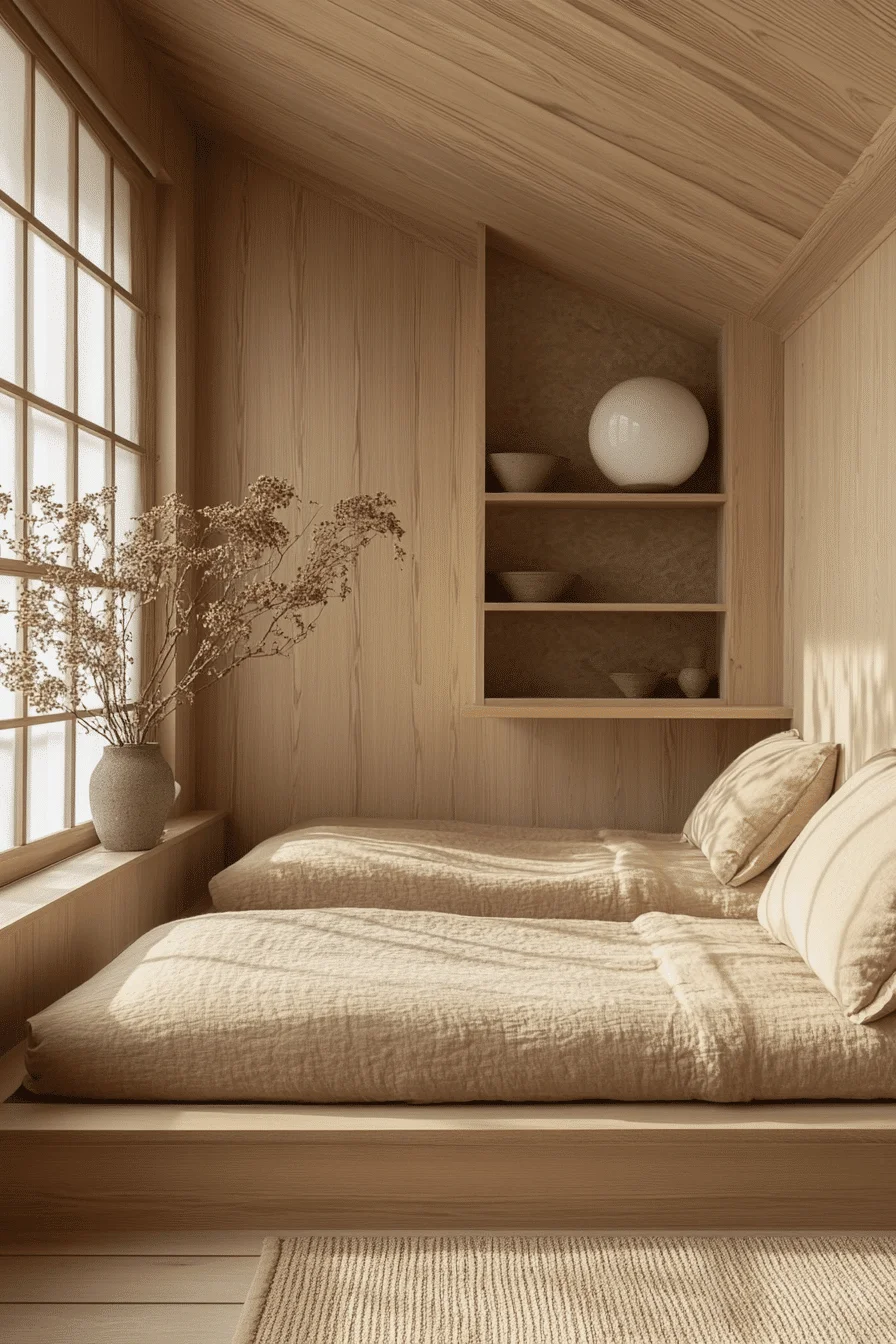
3. Minimalist Kids Retreat
This is for the parent who wants to foster focus and independence by removing the “noise” of traditional childhood decor. If you believe that a child’s imagination is the best toy in the room, this “Floor-Level Essentials” strategy is your guide. It’s a design that treats the floor as the primary living space, inviting kids to sprawl out and daydream in a room that feels physically and mentally wide open.
The soul of this design is horizontal calm. By keeping the furniture low and the color palette warm and earthen, you create a space that feels grounded. It’s a room that meets kids exactly where they are—on the floor—allowing them to feel safe, in control, and entirely unhurried.
The “Anatomy” of the Design
To achieve this grounded look, you have to prioritize natural materials that feel warm to the touch:
The Canvas: Use a color like Farrow & Ball Joa’s White. This isn’t a stark white; it’s a light, clean “biscuit” tone that feels sunny even on cloudy days. It provides a warm, historic feel that perfectly complements light oak.
The Anchor: A low wooden platform bed frame. By eliminating the height of a traditional bed, you make the ceiling feel higher and the room feel more expansive. The clean lines of the oak frame provide a sturdy, architectural feel.
The Light: The “hero” here is natural light filtered through shoji-style screens. This diffuses the sun into a soft, glowing haze, mimicking the peaceful atmosphere of a traditional Japanese tea room.
The Texture Hierarchy
In a minimalist room, “tactile comfort” replaces “visual decoration.” You want every surface to be an invitation to relax:
The Base: A woven jute rug for an organic, earthy foundation.
The Comfort: Crisp white linen bedding that looks effortlessly cool and stays breathable.
The Detail: A round oak side table and smooth ceramic accents to add “soft” geometric shapes that don’t have sharp, aggressive corners.
The Accent: A tall vase of dried pampas grass to add a feathered, vertical element that moves slightly with the breeze.
💡 Steal This Look
Paint Color: Farrow & Ball Joa’s White 226
Furniture: Low oak platform bed; round oak side table.
Lighting: Gridded wooden window frames with paper-style shoji screens.
Materials: Light oak, white linen, jute, and dried pampas grass.
💡 Pro Tip: The “Under-Bed” Secret
To maintain those clean Japandi sightlines, use natural seagrass baskets tucked beneath the platform bed. This allows you to store blocks, dolls, or art supplies right where the kids are playing on the rug. It keeps the “clutter” at floor level and hidden, so the rest of the room remains a visual sanctuary.
🔥 Avoid This: The “Vertical Break”
Avoid overhead ceiling fixtures. In a room designed for “horizontal calm,” a big, heavy light fixture in the center of the ceiling acts like a visual anchor that pulls the room down. This space should “breathe” through its windows.
Avoid bright, plastic storage bins. They clash with the “Joa’s White” and oak palette. Stick to natural fibers like seagrass or wicker to keep the sensory experience consistent.
The Verdict: This room is a lesson in “less is more.” It’s a space that trusts kids to find their own fun within the quiet, inviting them to hear their own thoughts and sprawl out in comfort.
Since we’ve mastered the “Grounded Essentials,” would you like to explore a Japandi Creative Workspace for homework and art, or perhaps a Nursery layout for the littlest ones?
4. Serene Japandi Nursery
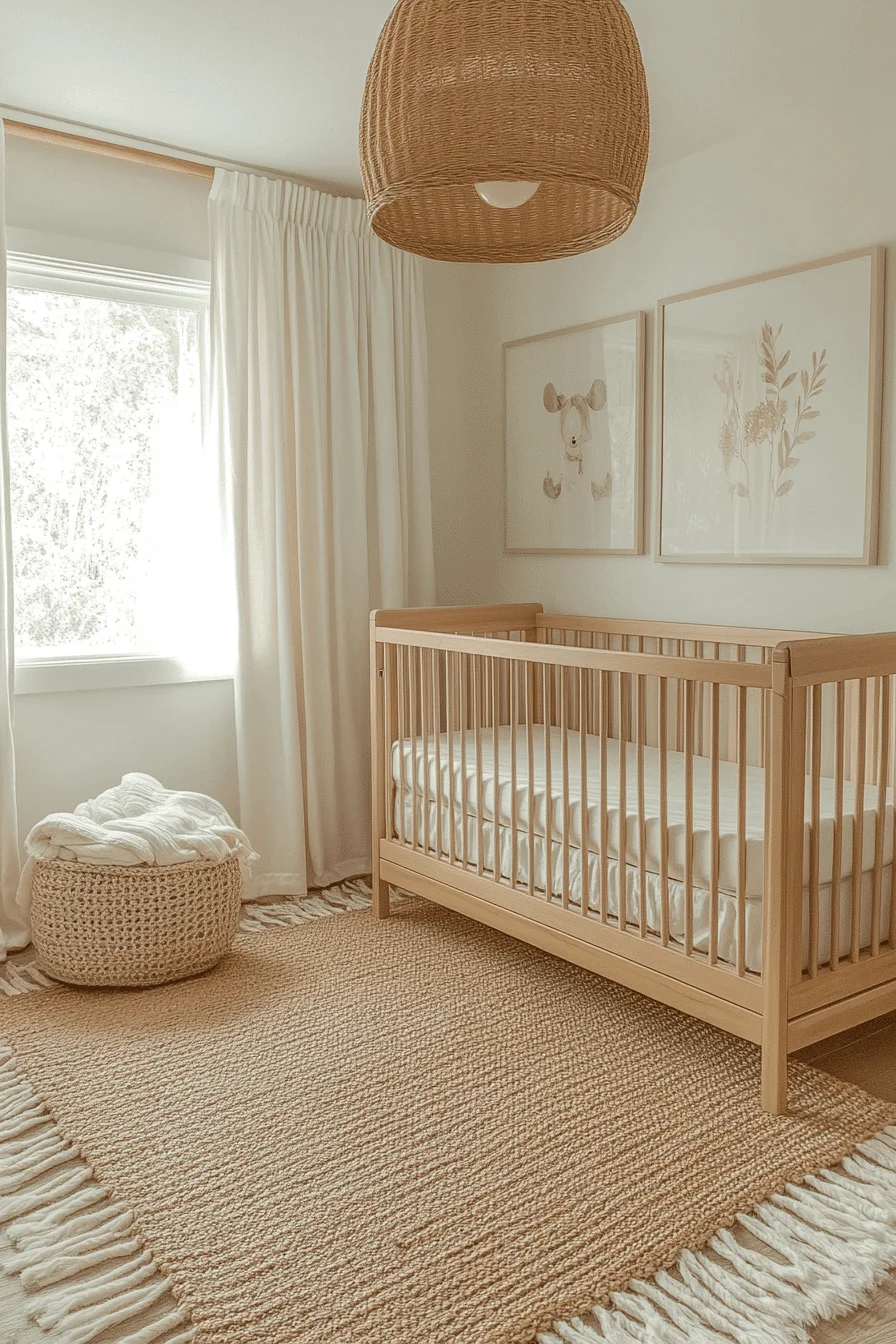
This is the ultimate design for the parent who wants to survive the “4th trimester” in a space that actively lowers your heart rate. If you believe that a nursery should be a sensory sanctuary for both baby and parent, this Tranquil Japandi Nursery is your blueprint. It’s a masterclass in using “visual silence” to create a room that feels like a deep breath—especially at 3 AM.
The soul of this design is uncomplicated serenity. By merging Scandinavian functionality (a crib that grows with the child) with Japanese minimalist calm, you create a space that feels balanced and breathable. It’s a design that rejects the “primary color” chaos of traditional nurseries in favor of ivory, sage, and the raw warmth of light oak.
The “Anatomy” of the Design
To achieve this level of peace, you must prioritize the “feel” of the materials over the quantity of the decor:
The Foundation: Use a color like Behr Swiss Coffee. It is a creamy, “soft-focus” white that provides a warm, sun-kissed backdrop. It makes the room feel bright during the day and cozy under dim lamplight at night.
The Anchor: A light oak convertible crib with vertical slats. The vertical lines add a subtle architectural rhythm to the room, while the natural wood grain provides a grounded, “living” texture.
The Glow: An oversized woven rattan drum pendant. When lit, the weave casts soft, rhythmic shadows across the walls, creating a “dappled sunlight” effect that is incredibly soothing for a baby’s developing eyes.
The Texture Hierarchy
In a room with minimal “stuff,” the textures become the decor. You want fibers that are as kind to the skin as they are to the eyes:
The Base: A jute rug with fringe. It adds an earthy, tactile boundary to the floor space.
The Comfort: Chunky knit cotton throws and natural linen curtains.
The Air: Layered cotton window treatments that filter the world outside into a soft, hazy glow.
🎨 Steal This Look
Paint Color: Behr Swiss Coffee 12
Furniture: Light oak convertible crib; minimalist wood rocker.
Lighting: Large woven rattan pendant.
Materials: Jute, chunky knit cotton, and unbleached linen.
🌟 Pro Tip: The “Double-Sheer” Nap Trick
To achieve the perfect naptime environment without the heaviness of blackout curtains, layer two thin white cotton curtains on a single rod. This creates a “diffuser” effect that softens the morning light into a gentle, sleepy haze rather than a sharp glare. It keeps the room feeling “airy” while still signaling to the baby that it’s time to rest.
⛔ Avoid This: The “Toxic” Color Trap
Avoid painted or brightly patterned crib bedding. High-contrast patterns can be overstimulating for a sleeping space. Stick to unbleached cotton or raw linen to maintain the calming, toxin-free aesthetic that defines the Japandi philosophy.
Avoid “clutter-core” shelving. Resist the urge to fill every shelf with plastic toys. Keep the walls clean and let the natural wood and soft fabrics do the talking.
The Verdict: This nursery is designed for the long nights and the early mornings. It is a space that trusts in the power of simplicity to soothe, making it the perfect retreat for a growing family.
Since we’ve mastered the “Newborn Sanctuary,” would you like to explore a Japandi Shared Room for older siblings, or perhaps a Creative Play Nook that uses these same calming principles?
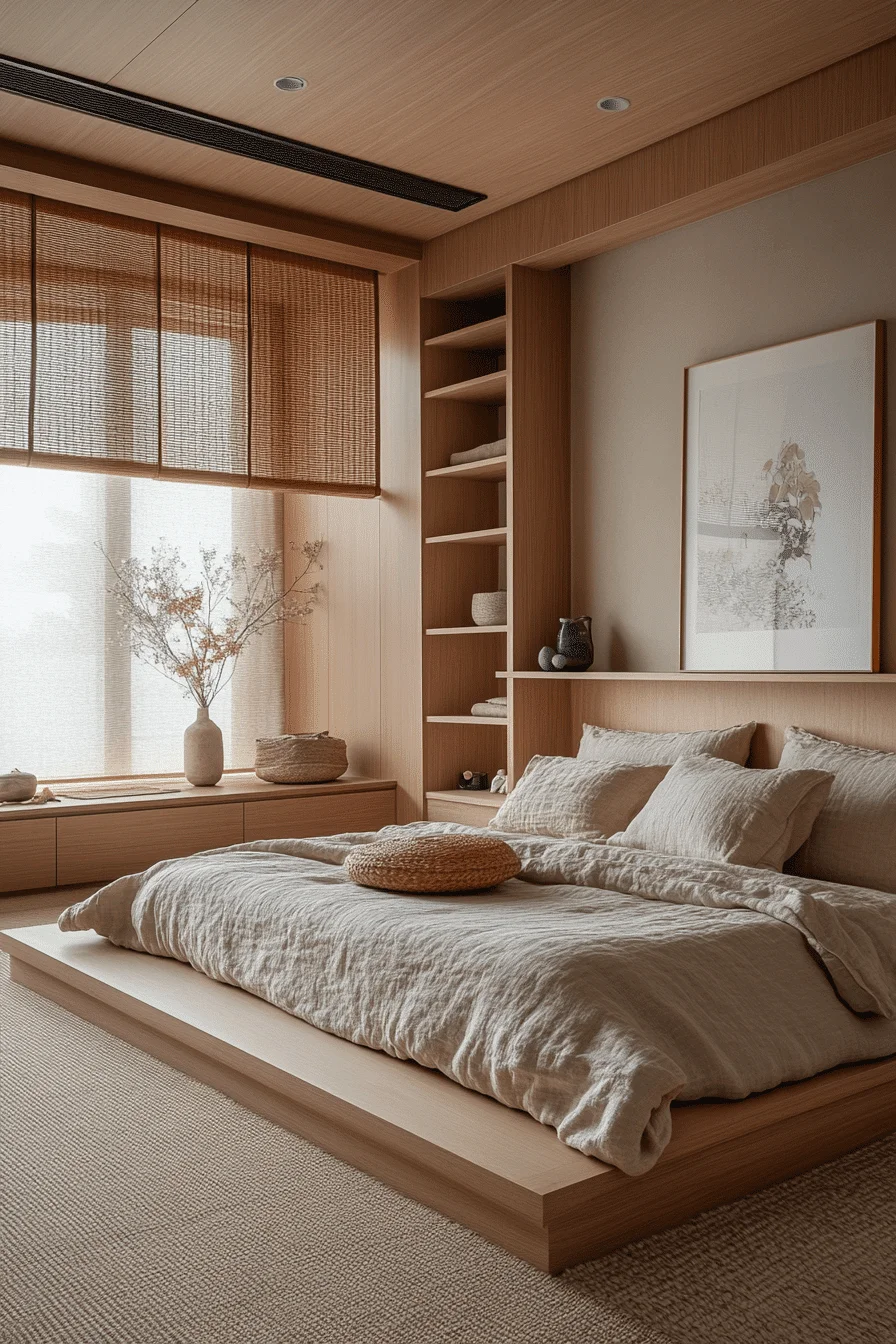
5. Japandi Shared Bedroom
This is for the parents of siblings who are tired of the “double the kids, double the chaos” mentality. By applying the Japandi principles of symmetry and restraint, you can transform a shared bedroom from a cluttered battleground into a shared sanctuary. It is a masterclass in spatial cooperation, where the design itself encourages children to respect the shared air and keep the peace.
The soul of this design is rhythmic balance. By using matching low-profile beds and a strictly neutral palette, you remove the visual “noise” that usually comes with two of everything. The room feels grounded and cohesive, offering each child a sense of their own territory without the need for physical dividers that would shrink the space.
The “Anatomy” of the Design
To pull off a meditative shared space, you must prioritize integrated architectural features over bulky, mismatched furniture:
The Foundation: Use a color like Valspar Natural Linen. It’s a “living” neutral that carries enough warmth to bridge the gap between the honey-toned oak and the creamy textiles.
The Sleep Zone: Matching low honey oak platform beds. Keeping the beds at floor level maintains a low center of gravity for the room, making the ceiling feel infinitely higher and the shared space feel less crowded.
The Architecture: Vertical grain oak paneling on a focal wall. This adds a sense of “height” and sophisticated texture that replaces the need for posters or busy wallpaper.
The Texture Hierarchy
In a shared room, “tactile consistency” is what keeps the space feeling unified:
The Bedding: Slubby linen in raw cream. The “slubs” (small, natural bumps in the fabric) add a rustic, handmade quality that feels luxurious yet durable.
The Grounding: A large woven jute rug that spans the entire play area, providing a shared foundation for both kids to interact.
The Accents: Hand-thrown ceramic vessels and dried botanical branches. These “living” elements bring the outside in and add a layer of wabi-sabi (perfectly imperfect) beauty.
★ Steal This Look
Paint Color: Valspar Natural Linen 6002-1A
Furniture: Low honey oak platform beds; built-in wall niche shelving.
Lighting: Large grid-paned casement windows (natural light focus).
Materials: Vertical grain oak, slubby linen, and hand-thrown ceramics.
🔎 Pro Tip: The “Relaxed Bed” Strategy
To capture that authentic Japandi warmth, stop tucking the sheets so tight. Keep the linen bedding deliberately rumpled and relaxed. This casual texture is central to the “lived-in” feel of the style. More importantly, it invites kids to actually use their beds for reading or lounging during the day without the “don’t mess up the room” anxiety that stiff, formal bedding creates.
❌ Avoid This: The “Double Trouble” Clutter
Avoid overhead ceiling fixtures. High, bright lights in a shared room can feel harsh and clinical. Let the room breathe through the natural glow of the window.
Avoid plastic storage bins. They break the “tactile material story.” If you need to store toys for two, use large woven baskets or integrated oak drawers beneath the beds to keep the aesthetic seamless.
The Verdict: This room proves that sharing a space doesn’t have to mean sacrificing style. It is a meditative retreat that teaches siblings that “less is more” and that a calm environment is a shared responsibility.
Is this the final layout for your Japandi series, or are you interested in seeing a “Creative Study Zone” for older children?
6. Simple Style Kids Room
This is the design for the parent who wants to escape the cycle of redecorating every three years. By leaning into intentional simplicity, you create a “future-proof” environment. This room doesn’t just house a child; it anchors them, providing a sensory-neutral backdrop that is as appropriate for a toddler’s afternoon nap as it is for a teenager’s late-night study session.
The soul of this design is material honesty. By removing “juvenile” distractions like bold patterns or plastic toys, the focus shifts to the warmth of the oak grain and the softness of the linen. It is a masterclass in visual longevity, where the room’s character comes from how the light hits the raw ceramics and the dried botanicals rather than from a temporary trend.
The “Anatomy” of the Design
To achieve this timeless, “ageless” aesthetic, you must prioritize pieces that prioritize function and organic beauty:
The Foundation: Use a color like PPG Swiss Coffee. This is a creamy, “historic” white that carries enough warmth to prevent the room from feeling clinical or cold. It acts as a soft reflector, turning even the dimmest morning light into a warm glow.
The Anchor: A low platform bed frame with integrated storage. By keeping the bed close to the floor, you maintain that signature Japandi horizontal calm. The hidden storage ensures that the “clutter” of different life stages (from diapers to textbooks) stays out of sight.
The Shelving: Floating oak wall shelves. These replace bulky bookcases, keeping the floor space clear and allowing the child’s current favorite objects to serve as the “decor.”
The Texture Hierarchy
In a room without bright colors, “tonal layering” is what creates the cozy, lived-in feel:
The Bedding: Washed linen in ivory and oatmeal. Linen is the ultimate Japandi fabric because it celebrates “wabi-sabi”—the beauty of imperfection.
The Accents: Raw ceramic pottery and dried botanicals. These add a “sculptural” element to the room that feels sophisticated and grounded.
The Light: Sheer linen curtain panels. These don’t just block light; they style it, diffusing the sun into a hazy, painterly glow.
🎨 Steal This Look
Paint Color: PPG Swiss Coffee PPG1075-1
Furniture: Low oak platform bed; floating oak shelving.
Lighting: Diffused natural light via sheer linen treatments.
Materials: Washed linen, raw ceramic, and natural oak wood.
⚡ Pro Tip: The “Intentional Wrinkle”
To prevent a minimalist room from feeling “sterile” or “cold,” layer your linen bedding without smoothing it. Those intentional wrinkles in ivory and oatmeal tones are the secret to that signature Japandi warmth. They signal that the room is a place for rest and reality, not a showroom.
⛔ Avoid This: The “Plastic” Intrusion
Avoid bright primary colors. These break the meditative spell of the earthy palette. If your child has colorful toys, use the integrated bed storage or closed oak cabinets to house them.
Avoid plastic storage bins. They feel “cheap” and modern against the organic, aged feel of the ceramics and wood. Stick to woven baskets or wood crates if extra storage is needed.
The Verdict: This is a room designed for the long haul. It is a peaceful, intentional retreat that trusts in the beauty of raw materials to provide a lifetime of calm.
Does this complete your Japandi series, or are you ready to explore one last layout for a “Creative Studio” or “Homework Nook”?
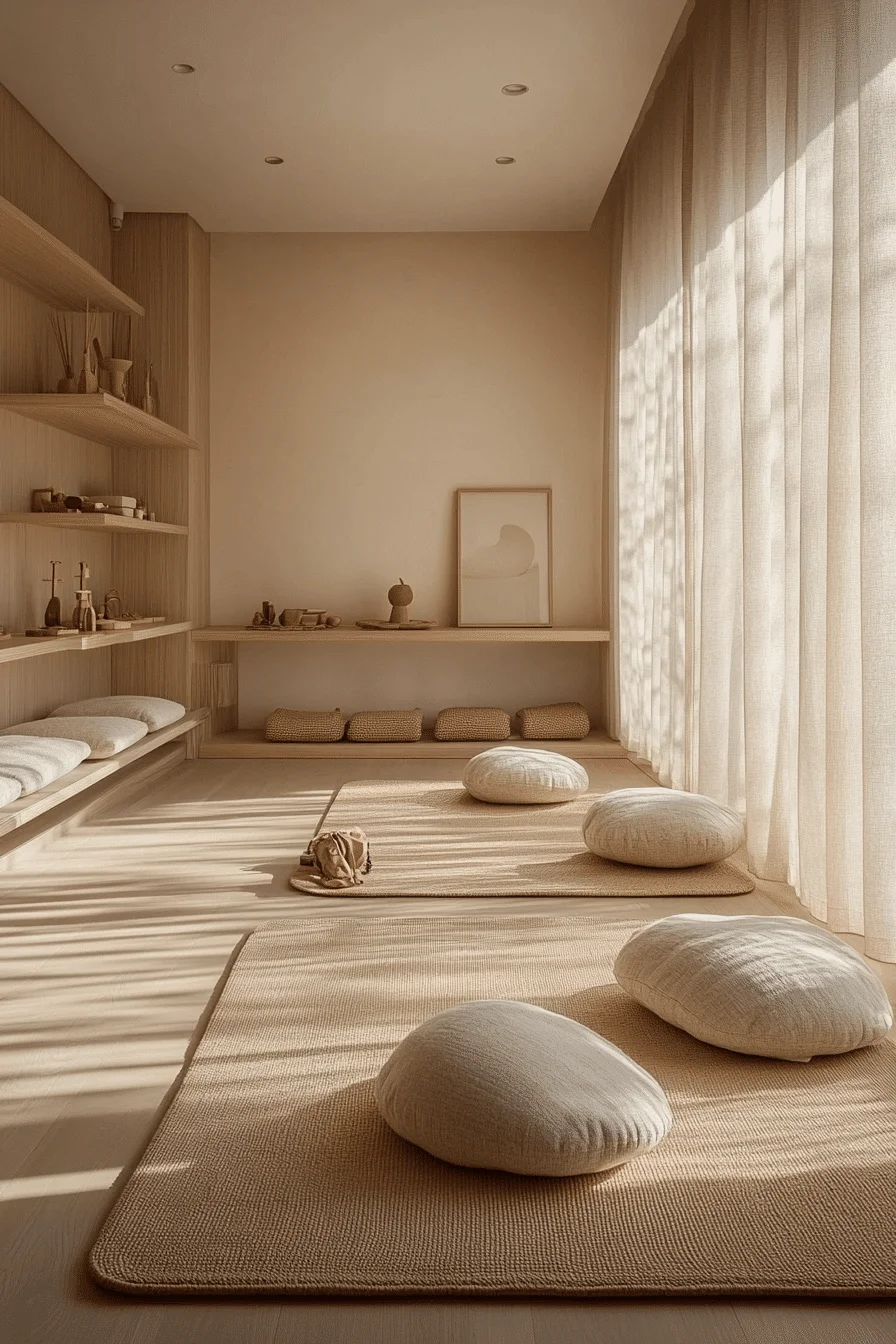
7. Quiet Tones Playroom
This is the design for the parent who wants to escape the cycle of redecorating every three years. By leaning into intentional simplicity, you create a “future-proof” environment. This room doesn’t just house a child; it anchors them, providing a sensory-neutral backdrop that is as appropriate for a toddler’s afternoon nap as it is for a teenager’s late-night study session.
The soul of this design is material honesty. By removing “juvenile” distractions like bold patterns or plastic toys, the focus shifts to the warmth of the oak grain and the softness of the linen. It is a masterclass in visual longevity, where the room’s character comes from how the light hits the raw ceramics and the dried botanicals rather than from a temporary trend.
The “Anatomy” of the Design
To achieve this timeless, “ageless” aesthetic, you must prioritize pieces that prioritize function and organic beauty:
The Foundation: Use a color like PPG Swiss Coffee. This is a creamy, “historic” white that carries enough warmth to prevent the room from feeling clinical or cold. It acts as a soft reflector, turning even the dimmest morning light into a warm glow.
The Anchor: A low platform bed frame with integrated storage. By keeping the bed close to the floor, you maintain that signature Japandi horizontal calm. The hidden storage ensures that the “clutter” of different life stages (from diapers to textbooks) stays out of sight.
The Shelving: Floating oak wall shelves. These replace bulky bookcases, keeping the floor space clear and allowing the child’s current favorite objects to serve as the “decor.”
The Texture Hierarchy
In a room without bright colors, “tonal layering” is what creates the cozy, lived-in feel:
The Bedding: Washed linen in ivory and oatmeal. Linen is the ultimate Japandi fabric because it celebrates “wabi-sabi”—the beauty of imperfection.
The Accents: Raw ceramic pottery and dried botanicals. These add a “sculptural” element to the room that feels sophisticated and grounded.
The Light: Sheer linen curtain panels. These don’t just block light; they style it, diffusing the sun into a hazy, painterly glow.
🎨 Steal This Look
Paint Color: PPG Swiss Coffee PPG1075-1
Furniture: Low oak platform bed; floating oak shelving.
Lighting: Diffused natural light via sheer linen treatments.
Materials: Washed linen, raw ceramic, and natural oak wood.
⚡ Pro Tip: The “Intentional Wrinkle”
To prevent a minimalist room from feeling “sterile” or “cold,” layer your linen bedding without smoothing it. Those intentional wrinkles in ivory and oatmeal tones are the secret to that signature Japandi warmth. They signal that the room is a place for rest and reality, not a showroom.
⛔ Avoid This: The “Plastic” Intrusion
Avoid bright primary colors. These break the meditative spell of the earthy palette. If your child has colorful toys, use the integrated bed storage or closed oak cabinets to house them.
Avoid plastic storage bins. They feel “cheap” and modern against the organic, aged feel of the ceramics and wood. Stick to woven baskets or wood crates if extra storage is needed.
The Verdict: This is a room designed for the long haul. It is a peaceful, intentional retreat that trusts in the beauty of raw materials to provide a lifetime of calm.
Does this complete your Japandi series, or are you ready to explore one last layout for a “Creative Studio” or “Homework Nook”?
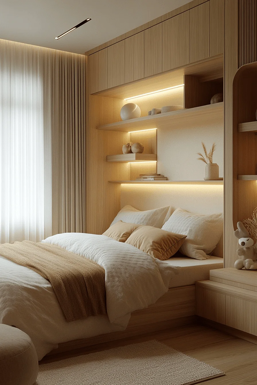
8. Light Wood Kids Haven
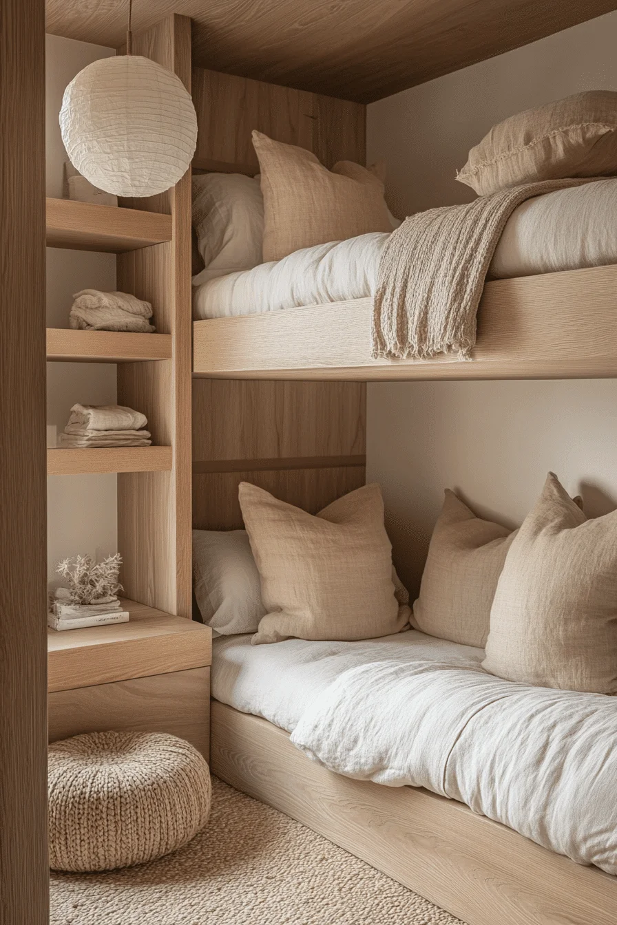
This is for the family that needs to maximize vertical space without sacrificing the room’s soul. By treating a bunk bed as a piece of “living architecture” rather than a piece of furniture, you turn a shared room into a warm, wood-wrapped sanctuary. It’s a design that feels both adventurous for the kids and deeply reassuring for the adults, proving that “functional” can still be “zen.”
The magic of this layout is in the continuity of the wood grain. When you use light oak for everything from the beds to the shelving, the furniture starts to feel like part of the walls. This reduces the “visual weight” of the bunk beds, preventing the room from feeling cramped and instead creating a cozy, treehouse-like atmosphere.
The “Anatomy” of the Design
To achieve this level of integrated calm, you have to prioritize matte, organic materials that invite touch:
The Canvas: Use a color like Clare Paint Whipped. it is a soft, airy white that mimics the look of fresh cream. It provides a clean, modern backdrop that lets the honey-colored oak grain truly “pop” without looking yellowed.
The Powerhouse: A built-in light oak bunk bed. By building the bed into the room with integrated drawers and shelving, you eliminate the need for extra dressers or bookcases. This keeps the floor space open and the sightlines clear.
The Glow: A white rice paper sphere pendant. This is a Japandi icon. It diffuses light in 360 degrees, creating a soft, moon-like glow that eliminates harsh shadows and makes the wood feel incredibly warm at night.
The Texture Hierarchy
In a wood-forward room, you need “soft landings” to balance the hard surfaces:
The Grounding: A woven jute rug. Its gritty, natural texture provides a perfect earthy base for the smooth oak.
The Depth: Slubby linen bedding and chunky knit cotton throws. The irregular weave of the linen adds a layer of “perfect imperfection” (wabi-sabi) to the bed.
The Accent: The rice paper of the lamp, which adds a fragile, weightless contrast to the sturdy wood.
🌟 Steal This Look
Paint Color: Clare Paint Whipped CL 01
Furniture: Built-in light oak bunk beds with integrated storage.
Lighting: Rice paper sphere pendant with a minimalist black cord.
Materials: Light oak, slubby linen, jute, and rice paper.
🚀 Pro Tip: The “Neutral Triad” Bedding
To achieve professional-level Japandi depth without using a single “color,” layer three distinct neutral tones on the bed. Start with a cream base sheet, add oatmeal pillows, and finish with a natural sand throw at the foot. This “tonal layering” creates a sense of richness and luxury while keeping the overall palette calm and unified.
⛔ Avoid This: The “Gloss” Mistake
Avoid high-gloss or lacquered finishes. Shine reflects light in a way that feels “plastic” and modern. Japandi thrives on matte, raw finishes that celebrate the natural texture of the material.
Avoid bright primary colors. A single bright red or blue bin can shatter the organic atmosphere. If the kids have colorful toys, tuck them away in the integrated oak drawers where they are easy to find but hard to see.
The Verdict: This room is a gentle exhale. It’s a space where raw wood and soft textiles create a secure, stylish environment that will look just as good in five years as it does today.
Since we’ve explored everything from nurseries to built-in bunks, do you feel this series is complete, or would you like a final deep-dive into a “Japandi Study Nook” for school-aged kids?
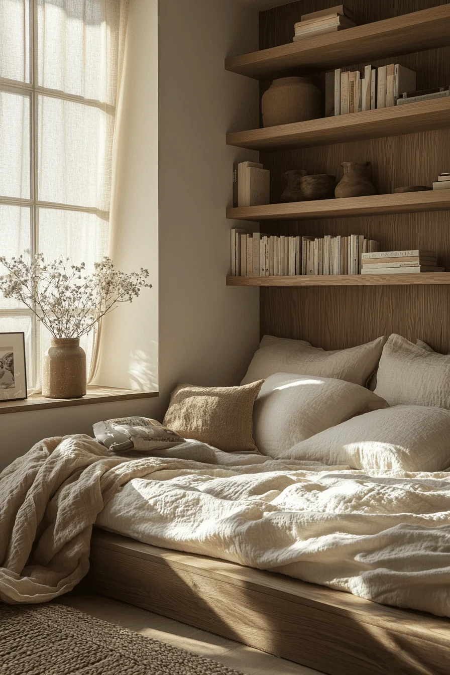
9. Japandi-Inspired Sleep Space
This is for the parent who wants to design for the child’s perspective, not the adult’s. By lowering the center of gravity and prioritizing “built-in” architecture, you create a space that feels like a grounded, safe, and quietly beautiful landscape. It’s a design that respects a child’s independence—giving them a bed they can climb into and a bench they can inhabit—while keeping the aesthetic sophisticated enough for the rest of the home.
The soul of this design is spatial intentionality. By creating a clear division between the sleep zone and the window nook, you mentally prepare a child for different modes of the day. The “horizontal” focus keeps the room feeling expansive and airy, while the soft earth tones provide a sensory-neutral backdrop that promotes deep, uninterrupted rest.
The “Anatomy” of the Design
To achieve this level of high-end tranquility, you have to treat the storage and seating as part of the room’s skeleton:
The Foundation: Use a color like Fine Paints of Europe Warm Taupe. This is a rich, earthen neutral that feels more substantial than white but softer than brown. It wraps the room in a “cocoon” effect that feels incredibly safe.
The Anchor: A white oak platform bed. The integrated headboard shelf replaces the need for a nightstand, keeping the floor area clear and reducing the number of furniture “legs” that can make a small room feel cluttered.
The Reading Nook: A built-in window bench. This is the bridge between rest and play. With storage drawers tucked beneath, it acts as a “stealth” toy box while providing a sun-drenched spot for reading or daydreaming.
The Glow: Linear cove lighting. By hiding the LEDs in a wood ceiling or behind a trim, the light “washes” the surfaces rather than glaring from a single point, maintaining a clean, unobstructed ceiling plane.
The Texture Hierarchy
In a taupe and oak room, you need varied organic grains to add “quiet” visual interest:
The Window: Bamboo matchstick blinds. They add a rhythmic, linear texture that filters the sun into “zebra-stripe” shadows.
The Comfort: Belgian linen bedding. It has a natural weight and “bounce” that looks better the more it is used.
The Earth: Unglazed ceramic vessels and a handwoven jute rug to provide a matte, gritty contrast to the smooth oak.
★ Steal This Look
Paint Color: Fine Paints of Europe Hollandlac Warm Taupe 1015
Furniture: Low-profile white oak platform bed; built-in window bench with drawers.
Lighting: Warm 2700K recessed downlights and linear cove lighting.
Materials: White oak, Belgian linen, jute, and bamboo.
🔎 Pro Tip: The “Wabi-Sabi” Moment
To bring the room to life, place one sculptural dried branch in a matte ceramic vessel on the window bench. This adds a “wabi-sabi” (beauty in the natural and aged) element that doesn’t feel like “decor” you have to protect. It’s sturdy, natural, and adds a vertical focal point that kids won’t easily disturb while playing.
✋ Avoid This: The “Visual Noise” Clutter
Avoid overhead pendant lights. In a room focused on a clean ceiling plane and horizontal calm, a hanging fixture acts like a “visual speed bump.” Stick to cove or recessed lighting to keep the air feeling clear.
Avoid plastic bins or character bedding. These are the quickest ways to shatter the meditative spell of the earth tones. If you need a “pop” of life, let it come from the child’s books or wooden toys.
The Verdict: This room is a retreat from the world. It trusts the child with a sophisticated environment and rewards them with a space that feels like a physical deep breath every time they walk through the door.
Does this wrap up your Japandi series, or are you ready for one final look at a Creative Study Nook for older kids?
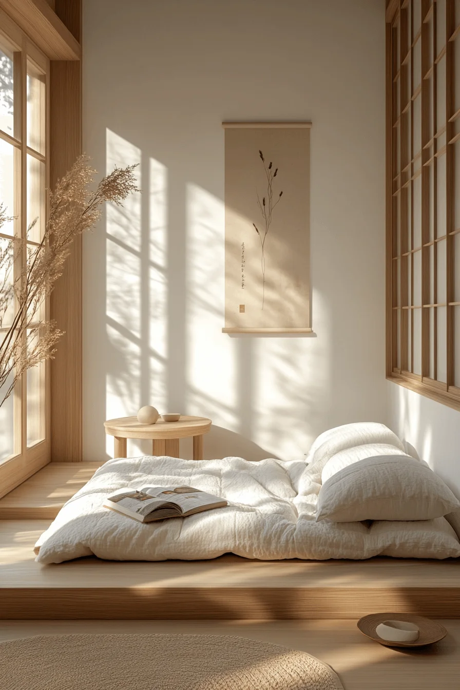
10. Tranquil Kids Corner
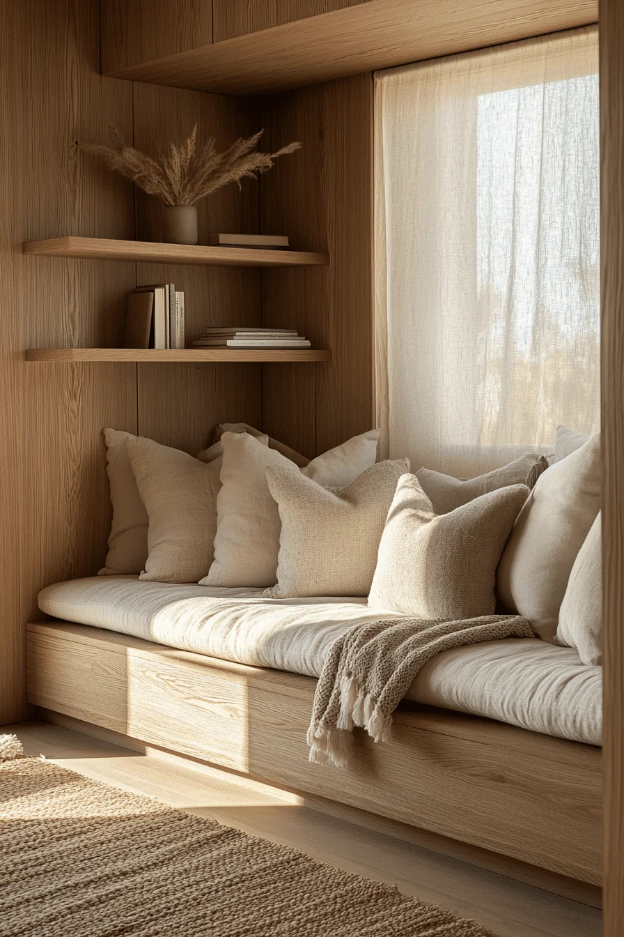
This is for the parent who wants to create more than just a place to sleep—it’s for creating a place to be. By focusing on a dedicated corner for unwinding, you acknowledge that children need a “sanctuary within a sanctuary.” This Rest & Reflection strategy is a masterclass in emotional wellness, using design to signal that it’s okay to slow down, sit still, and let the imagination take over.
The soul of this design is unhurried comfort. By transforming a simple window area into a built-in “nest,” you provide a child with a sense of security and a front-row seat to the natural world. It is a space that feels sacred—where the low-profile furniture and soft, sandy tones create a “buffer” against the fast-paced noise of the outside world.
The “Anatomy” of the Design
To achieve this level of grounding tranquility, you must blend the architecture of the room with the softness of the textiles:
The Foundation: Use a color like Backdrop Sandlot. It’s a warm, sun-baked beige that feels like a beach in late afternoon. It creates a seamless transition between the white oak wood and the cream fabrics, making the walls feel like they are “hugging” the space.
The Anchor: A built-in oak window bench. This is the heart of the “reflection zone.” By including under-seat drawers, you ensure that the books and quiet-time activities are always within reach but never in the way.
The Verticality: Floating corner shelves. These turn an unused corner into a display for 2–3 “soulful” objects—perhaps a favorite wooden toy or a smooth stone—keeping the visual weight light and intentional.
The Light: Skip the lamps. This room is designed to be experienced in natural daylight. Sheer linen curtains act as a soft-focus lens, washing the honeywood in a gentle, ethereal glow.
The Texture Hierarchy
In a space meant for “unwinding,” the tactile experience is the most important factor:
The Seat: Slubby linen upholstery. It’s durable enough for daily use but has a raw, organic texture that feels sophisticated.
The Layering: A chunky wool knit throw draped over the bench to add immediate “visual warmth.”
The Detail: A tall vase of dried pampas grass in the corner to add a soft, feathered movement to the air.
🌟 Steal This Look
Paint Color: Backdrop Sandlot 01
Furniture: Built-in oak window bench with drawers; floating corner shelves.
Lighting: Natural light focus; sheer linen window treatments.
Materials: White oak veneer, slubby linen, chunky wool, and jute.
🚀 Pro Tip: The “Pillow Pyramid”
To create that plush, sink-in feeling kids crave for quiet time, layer three sizes of linen pillows. Start with large bolsters against the wall for back support, add standard squares for softness, and finish with small lumbar pillows for “nesting.” Mixing these sizes in ivory and oatmeal tones creates a professional, high-end look that remains incredibly cozy.
❌ Avoid This: The “Artificial” Interference
Avoid artificial fixtures if possible. If you must have light for the evening, use a small, hidden warm-LED strip under a shelf rather than a central ceiling light. The goal is to let the natural rhythm of the sun dictate the energy of the corner.
Avoid high-contrast colors. In a “reflection” space, your eyes should be able to rest. Stick to the honeywood and sand palette to keep the heart rate low and the focus high.
The Verdict: This is a room that supports emotional wellness through every grain of wood and every layer of linen. It is a safe, sacred corner where a child can truly reset.